I’ve been reading ‘How to Win the Premier League‘ by Ian Graham recently, and it gave me an idea to further my studies into AI/ML and in particular, Neural Networks.
I blogged last year about the fundamentals of neural networks; giving me a mental model of how and why they work. But since then, I’ve been wanting to train a ‘real’ neural network. Ian’s book gave me just the idea!
Whether it’s Expected Goals or the Possession Value Model, the general idea is crunching data to form a statistical model that we can use to evaluate team and player performance, both past and future, for the purposes of recruitment, player improvement and more.
So what was my idea? It’s almost certainly been done before, but could I create a neural network that predicted the likely next best pass in a football match? This clearly wouldn’t be complex enough for production use cases, but you can see how one that is complex enough might be useful to evaluate player performance or even be used as the AI in a video game!
Building the Neural Network
Where do you start when it comes to training a neural network?
What do you want to predict?
What data do you have to make those predictions on?
I wanted to predict the next next best pass in a football match and in order to do that, I needed some data on where the ball was, who was in possession of it and where everyone was on the pitch. I discovered some data by SkillCorner that included data for 10 matches from the Australian A-League. The data essentially consisted of events data (when passes were made, etc.) and positioning data (where players are on the pitch at each frame).
With data available, I could focus on the three main elements of any neural network.
How do I structure my inputs for training (and therefore inference)?
How do I structure my outputs? Do I want a single value or a distribution?
What do I put between the input and output to train a network of sufficient complexity to model my scenario generically?
Design
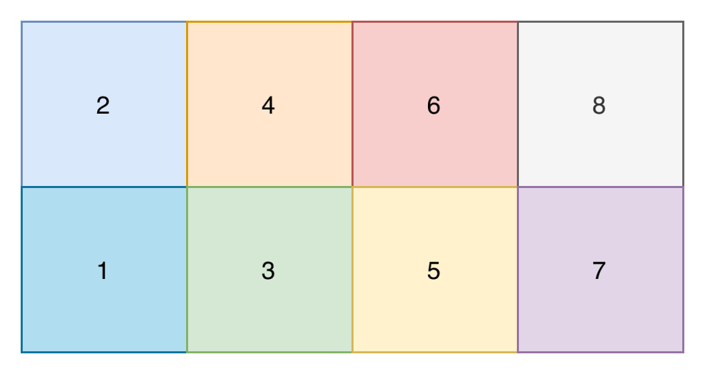
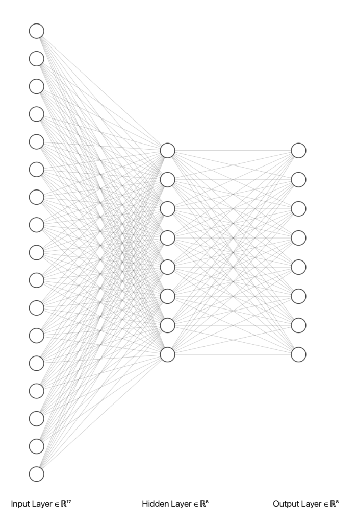
The core of my neural network design centred around the input shape. I didn’t want to create a complex input shape of the x and y position of every player on that pitch, because that seemed quite complex (though probably what you’d do if creating a model for real). Instead I opted for a model where the pitch is split up into 8 zones, and the input is the number of players (split on attacking and defending team) in each zone, and the zone that the ball is in.
Input Shape
An example input into the network would therefore look something like the below. The first number is the zone the ball is in, and each subsequent pair of numbers contains the number of attacking and defending players in that zone. Zone 1 is relative and is the attacking teams right back position
In fact, one of the most challenging parts of this project was parsing the data out of the training datasets and getting it into the right structure for the neural network!
There are other data preparation tasks you'd likely perform in preparing data for a neural network such as normalisation, but given this was a purely educational activity, I haven't.
Regarding the output shape, the main question on my mind was do I predict the zone directly (i.e. 2 or 7), or do I output a probability distribution across all zones. I decided on the latter as it would better demonstrate the neural networks ability to “learn”.
Output Shape
The output therefore looks like the below. The probability across all 8 zones adds up to to 1.
Designing the input and output shapes came somewhat naturally. At no point however did the design of the hidden layers of the neural network come naturally. In fact, it was purely based on experimentation. Well, I tested one approach and it seemed to work so I left it alone!
Layers
The idea of a neural network is that by ‘massaging’ weights and biases (parameters) in-between the input and output layer, you can find a configuration that results in accurate outputs. Feeding all inputs into one neuron with a single weight is unlikely to have enough complexity to model our problem. Equally, one with trillions of parameters is probably not economically viable to train and / or add much accuracy. However, it turns out if you connect each input to 8 neuron’s which then feed the output layer, you can create model that’s somewhat accurate (at least, the next best pass is generally plausible!)
As a result of this design, there are 216 trainable parameters.
Weights
Biases
Total Parameters
Dense 1 (Hidden Layer)
136
8
144
Dense 2 (Output Layer)
64
8
72
Total
200
16
216
Whilst not an exact comparison, large language models such as those provided by ChatGPT container trillions of parameters. Given much of the computational cost of models comes from training them, being able to achieve better accuracy per parameter is a key innovation area of neural networks.
Determining the structure of the neural network also requires you to choose activation methods for the neuron’s. In addition to ReLU, the softmax activation function which takes the outputs of the final hidden layer and returns a probability distribution across the output (zones). You’ll see softmax outputs in many categorisation models such as topic and sentiment detection. There’s not much on activation methods here as that’s my next area of study.
Implementation
Implementation of the neural network consists of a couple of stages:
Transforming data and organising it (splitting it in training and validation sets)
Creating the network structure (i.e. the layers and their configurations)
Training the network
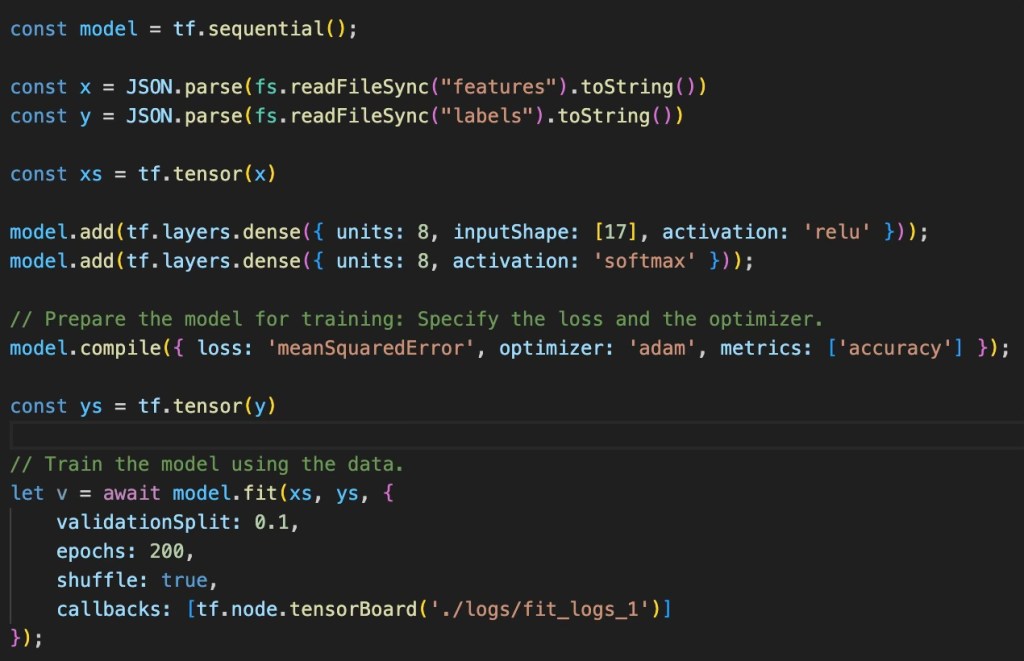
Thankfully, steps 2 and 3 are made incredibly simple by using frameworks such as TensorFlow.
Training
The SkillCorner dataset contains 10 football matches, with event and positioning data. Across 6 matches (I could have done all 10, but didn’t… for some reason!). The transformation step was essentially to look for each passing option event and for that event, find the positions of all the players on the pitch at that point in time. This resulted in 3680 passing scenarios where I could extract the features (the position of the players and the ball) and the labels (the zone that the pass was actually made to).
The network is initially created, with the relevant layers added to it (as discussed in the design). Finally, the fit method is called which takes in the features and labels and trains the parameters.
The compile method introduces 2 important elements of the training process, the loss and optimisation functions. Both elements are explained in my previous blog and so I won’t repeat that here. But to summarise, the loss function tells the training process how far it is from being accurate (according to the training data) and the optimiser is the thing that ‘massages’ the parameters in such a way that reduces the model loss (a process known as backpropagation).
Two other parameters of interest are the validationSplit and epoch. A validationSplit helps test for overfitting; if the model can predict really well for its training data but is awful on inputs it’s never seen before, it’s said to be overfitted. Overfitting can happen when too many epochs are ran over a given amount of data. An epoch is a run through all the training data alongside the relevant optimisations; do this too many times on a small (relative to model complexity) amount of data and the model will be overfitted.
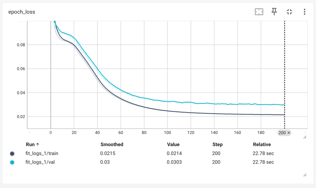
The diagram below shows the output of the loss function for each epoch. You want the loss to decrease to as close to 0 as possible.
As loss decreases, you’d expect accuracy to increase, which is exactly what we see. In both the loss and accuracy graphs, we can see the lull in performance between 10 and 20 epochs – I believe this is the optimiser finding its way out of local minima, where it believes it’s found the best parameter values and decreases the learning rate, only to find better solutions do exist.
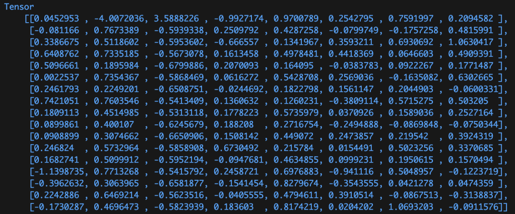
The result of the training process is a set of ‘massaged’ numbers. The image below shows the trained weights of the first dense layer, containing 136 weights (the biases aren’t shown below).
When a model is packaged up and distributed for use, it’s these weights and biases that are worth millions of dollars and worth protecting. Whilst some models are open-sourced (and therefore these values are visible), others aren’t and their structure and parameter values are kept secret.
Environmental Considerations
Notices how across both graphs above, the model performance ‘flattens’ out after around 100 epochs. Running an epoch is a computationally intensive process (for complex models) and as such, knowing how many epochs are suitable for the model can help decrease the costs of training runs. Cost both in terms of money, but also energy required.
The work required to train a model of this complexity (which isn’t very complex!) was 1000J, 100W for 10 seconds. The same amount of work required to lift an average adult male 1 meter off the ground on Earth. A standard residential solar panel would ‘generate’ the required energy, at the right power (i.e. > 100W) in a couple of seconds on a nice sunny day.
Training the LLMs we all use today takes on the order of terrajoules (trillions of joules). Something close to the amount of energy released in the atomic bomb dropped in Hiroshima. It would take a residential solar panel around 400 years to generate that much electrical energy. How much energy usage warrants the value provided by these models? Or perhaps more importantly, what methods of electrical energy generation are worth the value of these models? Fossil, Nuclear, Renewable?
Inference
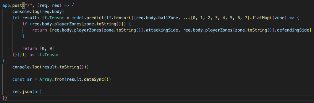
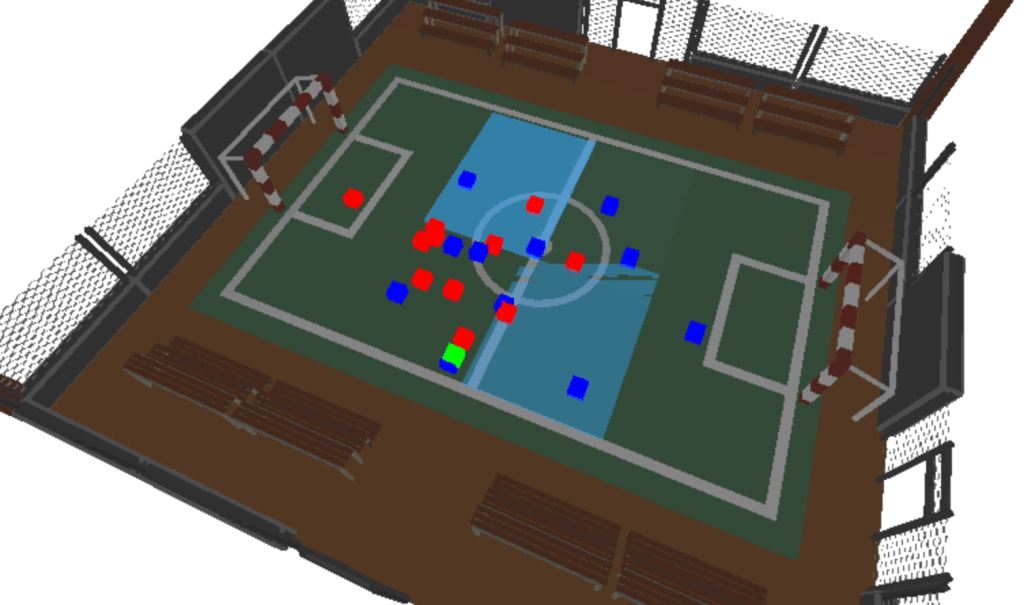
Now that we have a trained model, we can send it some data it probably hasn’t seen before (in the structure of the input shape) and get back a probability distribution of the best next passing zone. In my experimentation, I hosted my model behind a simple API, much like ChatGPT.
Visualisation
But that’d be an anti-climax of a blog!… I’m a massive fan of three.js, I’ve used it in previous blogs and find it’s a fantastic, easy to use method of visualising computational processes. The screenshot below and video at the top of this blog visualise one of the football matches in the SkillCorner dataset, overlayed with rectangles of varying opacity based on the models pass prediction response by zone. Pretty cool!
What Next?
The best part of any project is the ideas it gives you on where to take your studies next. For me that’s diving a bit deeper into neural networking concepts such as optimisation methods and activation functions. It also includes continuing by studies of Large Language Models, for which neural networks play a critical part.
Additionally, my role as a Software Engineer isn’t that of training any sort of Machine Learning models; I deploy them and utilise them within my applications. So how much do I need to know about this technology to do that well? I relate it back to understanding how transistors build up to create logic gates, that create Arithmetic Logic Units (ALUs) that create Central Processing Units (CPUs); I don’t directly apply this knowledge day-to-day, but it’s always in the back of my mind, validating decisions and ensuring I write performant and reliable code.
Finally, sports provide an exciting opportunity to learn more about statistical methods and Machine Learning techniques. With the open source data available to apply that learning, I can see myself getting lost in this area throughout 2026. I’ve just bought Soccermatics and can’t wait to get stuck into it.
Neural networks power many of today’s AI/ML advancements, from classification tasks such as object detection to GenAI. But how do they work?
The core concept of a neural network is that for some given inputs, the network produces an output which is some sort of prediction. Initially, that output is random, but by comparing it with the expected output and tweaking some of the inputs, the network can be tweaked until it generally produces the right output; this process is known as training.
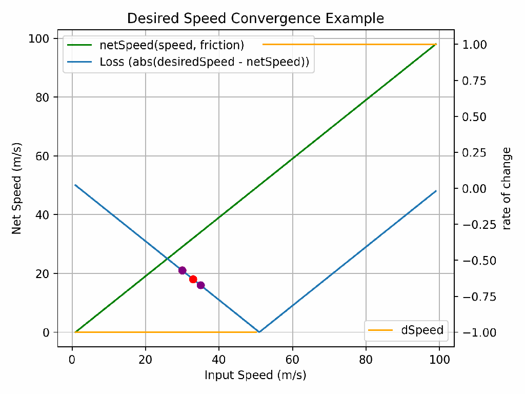
Assume we want to figure out how “fast” we must go in a car to reach a desired speed considering the negative effects of friction. Whilst you could figure this out in your head, the complexity of the calculations performed by neural networks mean we cannot, and we must find a computational way to determine the combination of inputs that give us the desired output.
If you perform the calculation 15m/s (speed without drag) – 1m/s (drag), you end up with 14m/s. If we want to travel at 13m/s, we therefore know we must travel at 14m/s. But how does a computer know whether to increase or decrease the speed (from 15m/s) to reach our required value? And by how much?
The answer to that is through understanding how the input speed impacts the rate of change of the functions output (net speed), known as the derivative with respect to speed. Or more specifically, the derivate of the loss (how far away we are from the desired speed, positive or negative). If I travel 7m/s – 1m/s, the results is 6m/s. If I go 8m/s, the result is 7m/s. For each increase in speed by 1/ms, I go 1m/s net faster… I know, a really complicated way of explaining something that’s obvious. But start simple.
If we take the derivative away from the initial speed we tried (i.e. -1 or +1 in our case, but it’s not always linear), we’ll eventually converge on the right answer. But how many iterations will that take? It would be the desired speed minus the starting speed. For such a simple calculation, that’s not such a problem, but when the functions we’re working on are much more complex (as they are in neural networks), each iteration takes significant compute and ideally, we’d like to reduce the number of iterations it takes to find the right answer. This process is known as optimisation and for the latest GPT models, this can cost tens of billions of dollars. So optimising the optimisation is incredibly important!
The learning rate is the answer to this problem. It defines what fraction of the derivative to apply. Too high of a learning rate and you’ll never find the right answer. Too low and it might take too long (or cost too much!). In the animation above, the purple dots have a higher learning rate than the red dots and so whilst they only take 5 iterations to go close to 0 loss, they never actually reach 0 loss. The red dots take 8 iterations, but do eventually find the right answer.
So how does all of this apply to neural networks? Well, a neural network consists of a much more complicated function than the one used here. Rather than having just one trainable parameter, input speed, they can have billions (known as weights and biases), all which have some impact (a derivate with respect to each parameter) on the output of the neural network.
What I find amazing is that this relatively simple maths, when scaled up, can take a series of inputs (“words” (it’s a bit more complex…, pixels, etc.), be ran through a function with some configurable parameters and the output can tell you whether that image contains a cat or a dog, or what word comes next. Mind blowing.
If interested, there’s a rough notebook available on my GitHub for you to explore yourself.
If you work 37.5 hours a week, should you be able to enjoy a good quality of life? What even is a good life for someone living in the UK?
The blog post follows Carol and Edward, a typical couple in the UK, from when they begin renting in their early 20s right through until retirement, raising 2 children over that period. It looks at the decisions they need to make, and when, to support what could be considered a good quality of life.
This blog post has been created through a modelled scenario on MyFinance. If you too want to plan your finances and like what you see in some of the visuals, you can sign-up and get started for free.
Good Quality of Life
So what is a good quality of life? There is no clear definition, but given a significant portion of happiness is derived through economics, it could at least require:
Each month, after bills, savings, etc. you should be able to go the cinema for a weekend date, for breakfast with the family or purchase a video game.
You, and your children, should not be dependent on parents financially. Whether that be getting on the housing marking or for childcare.
If your washing machine breaks or you need repairs to the roof, you shouldn’t be laden with years worth of debt and subsequent interest.
You should not have to choose between enjoying life now (within reason) or saving for your retirement. If you want to go on holiday each year as a family, you should be able to.
Above all, maintaining a good quality of life shouldn’t be dependent on getting into debt. Debt is not a bad thing, but at all times it should be a choice.
Edward & Carol
Carol and Edward live in the North of England and are a fairly typical couple. Throughout their life, they earn 10-15% above minimum wage in full time jobs. They’ll go on to get married and have 2 kids who’ll stay at home until their early 20s. Having met at college, Edward and Carol have decided to live together, but like many couples, they can’t afford a house. They are therefore renting a 1 bedroom apartment that they hope to stay in whilst they save for a house.
Saving for a House (5-6 years)
We join Edward and Carol at the kitchen table of their apartment where they’re working out what sort of house they can afford; the deposit they require and how much the monthly mortgage payment will be. Edward and Carol are still young and enjoy going on holiday, date nights and spending time catching up with friends and family at a local cafe every other weekend. As they look to being saving for a house, they’re keen not to sacrifice on the quality of life too much.
Carol and Edward begin looking at properties in the North of England where they live and can see that the median house price is around £200,000.
Based on current mortgage deals, this means they’ll need a 10% deposit (£20,000) and are looking at a monthly mortgage payment of around £1,000 a month. Carol and Edward are currently renting a property for £850 and so the monthly mortgage payment isn’t too much of a stretch. As for most first time buyers, the challenge is saving for a deposit.
They work out that over the next 7-8 years, if they save £1,800 a year into a government LISA with a 5% return and a 25% government bonus, they will be able to afford a deposit on a house in the local area.
But a house is not the only significant expense coming up on the short term. Edward and Carol are also hoping to get married in the next 5-6 years. If they save £1,500 a year towards a wedding, they’ll be able to afford a basic wedding. Their finances over this period are summarised below:
Finance Type
Amount (Annually)
Income (after Tax)
+ £43,000
Expenses
– £27,000
Savings (incl, etc.)
– £14,000
– Deposit
£1,800
– Wedding
£1,500
– Pension
£2,500
– General (Holidays, future, etc.)
£8,200
Loans & Credit
– £0
Disposable
£2,000
The astute reader will notice total annual general savings of £8,200 a year. What is all this money going towards?
Carol and Edward have been talking about also potentially starting a family once they’re in their new home. Due to not having the support of family for childcare, they would like Carol to take a period of leave (approximately 6 years) from their career to see the children into full time education.
Looking at their finances over this period, they work out that even with child benefit, maternity pay and some part time work, they’d get in to almost £60,000 worth of debt (excluding interest). They’d also take a hit to their quality of life, forgoing things like holidays and many home improvements.
The £8,200 is therefore to enable Edward and Carol to build a buffer of almost £60,000 over 8 years, allowing them to have and raise children whilst not paying almost thousands of pounds in interest paying off £60,000 worth of debt over many years.
This is a really interesting point. Carol and Edward must start saving for the early years of their children at least 8 years before they even have them. If not, it’s in this period of life that they would either fall into a life changing amount of debt or become reliant on the state, neither of which should be outcomes to achieve the basic goal of raising a family.
Buying a House and Future Proofing (1-2 years)
After 6 years, Edward and Carol have managed to save, via their LISA, £20,000 to put towards a house. They purchase a house in their local area for £220,000, taking on a mortgage of £200,000 at 4.1% interest. Their monthly payments being approximately £1,000.
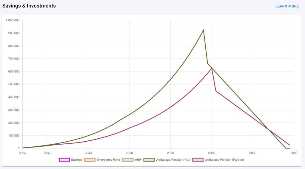
Now in a house and ready to start a family, with savings to enable them to do so, Edward and Carol turn to their retirement. Buying a house and raising a family has required almost 10 years of future planning, how long does it take to prepare for retirement?
Over the past 10 years, Carol and Edward have both been contributing the minimum amount into their workplace pensions (a combined employee / employer contribution of 8% of earnings). If they continue like that, they estimate they’ll have a combined retirement income worth around £1.5million. Retiring at 65 and with an average lifespan of 85 years, this must last them 20 years.
In today’s money, they would be able to take approximately a £150,000 lump sum and pay themselves £20,000 annually. With their mortgage having ended by the time they retire, this will see them through.
Using a tool such as MyFinance, they’re able to model inflation and other factors into their retirement planning to see what sort of income that will give them.
Raising a Family (21 years)
Carol and Edward have given birth to 2 children and whilst their quality of life has certainly taken a hit, their financial planning at least means it’s expected and planned for.
Once the children start school, Carol goes back into a similar full time job as before. Both Edward and Carol are lucky enough to have employers that support flexible working meaning that, again, they do not need to rely one expensive before and after school clubs. Their financial situation and therefore quality of life also improve during this period, giving them more disposable income each month (~£250) and allowing them to resume going on modest family holidays each year (~£1,500).
It’s at this point in life where decisions such as deciding to remortgage, move home, etc. all become potential options. Or more generally, a point at which deciding to take out loans (that come with interest) could be considered. Edward and Carol decide that if they remortgage and take £20,000 – £30,000 out of the house, they can use this to spruce up the family home. The effect of which is an extra £5,000 of interest paid on their mortgage.
It’s also through this period that their savings buffer of at max £10,000 can be used as both an Emergency Fund (replace the washing machine, etc.) and to support their children with activities such as learning to drive.
Back to Two (15 years)
Edward and Carol are now nearing their 50’s and the kids are leaving home. There’s still another 15 years to go until retirement and it’s during this period that money becomes a little easier. Not only is there less money being spent on expenses such as food, but the mortgage is coming to an end.
Whilst Carol and Edward haven’t been living month to month over the past 20 years, they’ve lived a modest life. They decide to enjoy themselves a little more during this period, going on some once in a lifetime holidays and reconnecting with some old hobbies. But additionally, it’s within this period that actions can be taken to bolster retirement.
In their mid 20s, they had planned for their retirement by modelling how their workplace pensions would support them. They’ve always wanted to stay in the family home for as long as possible, so they’d rather not take equity out of the home or downsize. But they’re aware that things like the State Pension are not guaranteed and so they consider what mitigations they can take. They could either contribute more into their pensions, or diversify with some more accessible investments through an ISA. This is what they decide to do, investing in a mix of bonds and shares through a managed fund.
Retirement (20 years)
Carol and Edward have now retired. They’re living comfortably in a house they own outright, they have £200,000 in the bank from savings and pensions lump sums as well as a small ISA. They’re able to spoil their grandkids, go on a number of holidays each year and enjoy their hobbies.
So What?
This is a modelled scenario where not a lot deviated from the plan. Throughout their life, Edward and Carol have enough of a savings buffer (an Emergency Fund) to cover any mishaps such as broken cars or home appliances, they’re living in the North where property is cheaper and they remain a couple with 2 income sources. But clearly life rarely goes like this.
So given this is the “happy” path, is the life that Edward and Carol have had acceptable for a hard working family in the UK? Should parents have to plan almost a decade in advance to support the early years of their children?
What if you live in the South or you’re single? Whilst this blog does not go into detail regarding those scenarios, it’s probably not hard to see that they’re largely unachievable.
But other support such as a Single Persons Tax Allowance (I’m not sure the Single Person Council Tax discount is enough), Home Improvement Grants (to enable people to purchase cheaper houses that require work that they can start instantly), 100% mortgages (with more stringent lender checks) and renters schemes (that essentially don’t punish people who can never build equity in a property) are all super important.
Above all, it’s incredibly important all households are equipped with the basic ability to manage their finances, both in the short term, but also the long term. Apps such as MyFinance are a step in that direction, but must be accompanied by financial education both in schools and the workplace.
Today, the sales pitch isn’t Digital, it’s Data; Data-driven, data as a first class citizen, data powered… This post aims to cut through the smoke and mirrors to reveal what’s behind the sales pitch, breaking down the key building blocks of any Data Analytics platform through a worked example following a fictions e-commerce organisation, Congo, on their journey to data driven insights… ok, I’m partial to a strap-line also!
This post focusses on native AWS Data Analytics services – as such, if you’re studying for your AWS Data Analytics Speciality, I hope this post can help you achieve that goal. Alternatively, if you’re just here out of curiosity, thank you for taking the time to read.
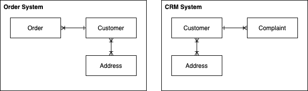
Congo.co.uk
Our customer, Congo… runs an online store that sells a wide range of products. The store runs on a number of key IT systems (known as operational systems) such as the Customer Relationship Management (CRM) system, the Order and Product Management systems and of course, the website.
Congo are sitting on years worth of customer and order information that they want to make use of to better serve their customers. They understand trends can be short-lived and seemingly random (i.e. the chessboard following the release of The Queen’s Gambit), whilst others are more seasonal (paddling pools over the summer). Further to this, trends vary across the globe (those in northern Canada probably aren’t a fan of outdoor paddling pools!). Congo believe that analysing this information can improve the customer experience and increase sales, an hypothesis that can be tested using Data Analytics.
What is Data Analytics
The end goal of any Data Analytics process is to inform a decision – the decision may be made by the analytics platform itself (i.e. a betting analytics platform might automatically change odds based on the result of some analytics) or by a human who is supported by the analytics. Where humans are involved, often the analytics platform must have a way of presenting information for human consumption – this is known as visualisation.
In Congo’s case, they hope that the analytics platform can make the decisions as to what products are ‘hot’ and for that information to be fed to their website automatically. However, they would also like dashboards showing them what impact these decisions are having on sales.
The initial design by the Congo IT team was to directly query the operational systems; however, they quickly encountered problems:
Whenever analytical queries are executed, the database saturates and customers are left reporting error messages on the online store.
Writing software to join the results of queries from multiple database technologies is challenging and error prone.
The process is very reactive – whilst this is fine for querying vast amounts of historic data, it’s slow when wanting to understand what’s happening right now (i.e. what products are being sold right now).
In short, due to the amount of data and questions being asked of it, the current IT isn’t capable of answering these questions whilst also supporting day-to-day operations such as allowing customers to purchase products. When an organisation finds themselves in this situation, the solution is typically to deploy a Data Analytics platform.
A Data Analytics platform must often solve for the following core problems:
The data doesn’t fit on a single computer.
Even if the data did fit on a single computer, the resources available (CPU, memory, IO, etc.) are not able to perform the analytics in an acceptable timeframe.
These issues typically mean that analytical platforms require many computers to work together, a technique known as Distributed Computing.
Distributed Computing for Data Analytics
Let’s assume we wanted to count the number of words in the dictionary – if I sat down and counted 1 word every second, it would take me a couple of days to come up with the answer. How can I speed this process up? If I split the dictionary into 3 equal pieces and found 3 friends to help (I’ve no idea what friend would help another do this…), I could count the number of words in the dictionary in a day. We’d each calculate how many words are in 1/3 of the dictionary (importantly, at the same time) and then at the end come together and sum the individual counts. This is the core concept behind distributed computing for data analytics.
When dealing with extremely large volumes of data, we need ways of splitting it up such as:
Spreading the data across a number of computers. For example, splitting a text file every 10 lines and sending each set of lines to a different computer, and
Reducing the amount of data that needs to be queried. For example, if looking for an electrician, you don’t scan through a list of all electricians in your country, you scan through those that are in your city. Any way that we can reduce the amount of data that needs to be queried can only improve the speed at which we can perform the analysis.
To introduce the concept of distributing data across many computers, we’ll consider two techniques:
Partitioning – to split data into an unbounded number logical chunks (i.e. I might partition on year, city, etc.)
Clustering – split data into a defined number of buckets whereby based on some algorithm, we know which bucket our required data is in.
In Congo’s case, to understand the longer term trends, they need to analyse a vast amount of historical data (terabytes) across 2 datasets to understand the number of products sold per year, per city, aggregated by product type (i.e. we sold 812,476 paddling pools in London in 2020). The 2 datasets involved are:
An Order table, and
A Product table containing reference data such as the product name, RRP, etc.
Querying this quantity of data on a single computer isn’t feasible due to the amount of time the query would take to run. As such, we need to use the 2 techniques mentioned to split the datasets so that they can be distributed amongst a number of computers.
The table below is an example of the Order table showing the PRODUCT_ID column which is a value we can use to look up product details in the Product table (i.e. I’ll be able to find PRODUCT_ID 111 in the Product table).
ROW_NO
NAME
CITY
YEAR
PRODUCT_ID
1
SIMON
LONDON
2020
111
2
JANE
YORK
2019
897
3
SIMON
BRIGHTON
2020
298
4
SIMON
LONDON
2019
61
5
SARAH
LONDON
2020
111
Order Table
As our queries are based on individual years and cities, we can start by partitioning the data on these attributes. Therefore instead of having a single file, we’d now have 4 (unique combinations of city & year). So if we wanted to answer the question how many products did we sell in London in 2020, we’d only have to query 1/4 of the data (assuming data was spread evenly across cities and years). Improvement.
However, this doesn’t help us quickly determine what products are being purchased – for example, products 123 and 782 might both be paddling pools, but unless we can query the Product table, we have no way of knowing. The Product table is also terabytes in size, so much like the Order table, we need a way of splitting the data up. It doesn’t make sense to partition the Product table as the Order table doesn’t contain any information within it that would allow a query planner (something that decides what files to look in, etc.) to know which partition to look in – it just has a PRODUCT_ID. In this example, clustering is required such that we can query a much smaller subset of the file knowing that the value we’re looking for is definitely in there.
Whereas with partitioning we could have an arbitrary number of partitions (i.e. we could keep adding partitions as the years go by), with clustering, we define a static number of buckets we want our data to fall into and employ an approach to distribute data across them such as taking the modulus (remainder) of some value, where the modulus is the number of buckets we’re distributing across. There’s obviously a happy medium to be struck – going to secondary storage is slow (particularly if it’s hard disk), therefore we don’t want to have to retrieve 1,000,000 files just to read 1,000,000 rows!
In our example, we cluster BOTH the Order and Product tables on PRODUCT_ID. You can see below how products IDs are distributed across the buckets. Note that we cannot change the number of buckets without also reassigning all of the items to their potentially new buckets.
PRODUCT_ID
BUCKET (mod 5)
111
1
897
2
298
3
61
1
Clustering
So now, when we want to know what the name of product 111 is, we need only look in bucket 1 which for the sake of argument will contain only 1/5 of the data. Similarly, in bucket 1 we’ll also find the data for PRODUCT_ID 61. You want to make sure whatever fields(s) you choose to bucket on has a high cardinally (range of values) such that you don’t get ‘hot’ buckets (i.e. everything going to one bucket and creating one huge ‘file’- this would result in little distribution).
With both partitioning and clustering employed, you can see the structure the Order table will follow:
Notice the ‘Column File’ in the above, columnar storage is common to data analytics whereby data is not stored by row (i.e. the customer record), but by column (i.e. a file with all surnames in). In an operational database, we typically operate on rows (records) as a whole – for example, we want to retrieve all of the data for an order so we can display it on a screen. With analytics, we typically only care about select columns to answer a particular question and by storing data by column, we can retrieve just the data we need and usually store is much more efficiently due to easier compression.
By storing our data by column, we only need to be concerned about the files that store the data we need to perform a query. For example, to satisfy the query SELECT ORDER_QUANTITY FROM ORDERS WHERE PRODUCT_ID = 2, we can simply load the ORDER_QUANTITY and PRODUCT_ID data from storage (for the relevant partition and / or cluster) to filter on the relevant WHERE condition and respond with the required data.
Approaches such as portioning and clustering require ‘developer’ input – however not all distribution approaches require this. If you’re interested in the topic, look at HDFS block distribution.
Now that we have an understanding of Data Analytics, the challenges and some techniques to mitigate them, we can look at solving Congo’s analytics problem.
Data Analytics Reference Architecture
As with most engineering problems, often the solution is not revolutionary – the solutions follow a similar template, but have some specialisations for specific use cases. In IT, these common solutions are referred to as Reference Architectures and are like cookie-cutters – they tell you what shapes you need but it’s up to you to pick the ingredients that make up the dough; reference architectures often do not stipulate specific products, leaving that to the relevant implementation.
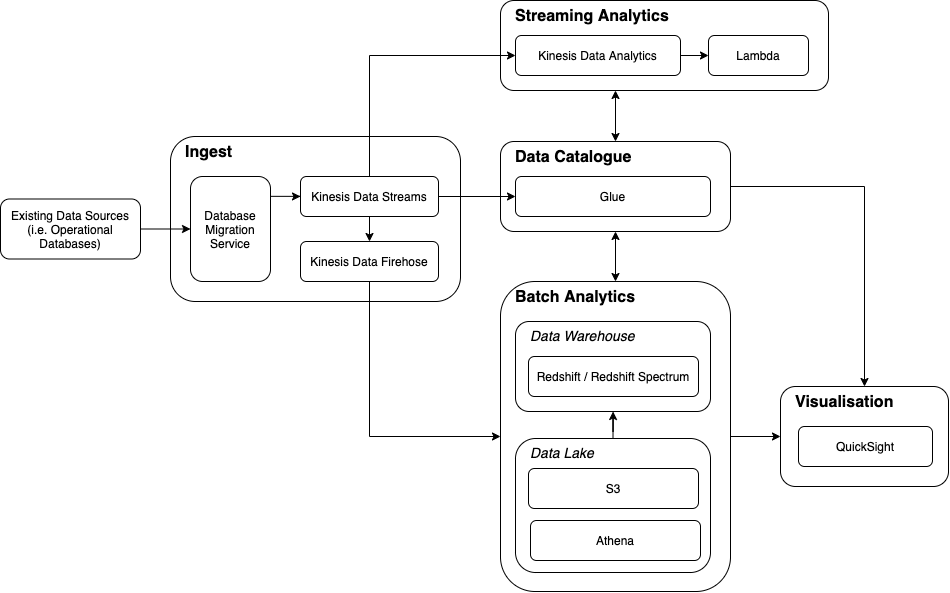
The Data Analytics Reference architecture used by Congo is below:
In summary, this architecture supports the ingest of data into an analytics platform for both batch and stream processing, with support for visualisation. The following sections explain each component of the Reference Architecture followed by an explanation of how AWS products relate to them.
Ingest
It is the role of the Ingest component to bring data into the analytics platform and make it available to the other components – this can be achieved in a number of ways such as:
Periodically copying entire datasets into the platform (i.e. copy to replace).
Applying the changes to the analytics platform as and when they happen in the operational database – a technique known as Change Data Capture (CDC).
Piggy-backing off of existing components such as message streaming architectures to also consume this information.
As part of ingesting data, we may wish to transform it so that it’s in a format the analytics platform can work with.
Once we have data inside the platform, we need to understand it’s format (schema), where it’s located, etc. This is the role of a Data Catalogue.
Data Catalogue
Data Catalogues can be complex systems – their core functionality is to record what datasets exist, their schema and often, connection information – a good example is Kaggle. However, they can be much more complicated offering capabilities such as data previews and data lineage.
Once the catalogue is populated with schemas, it can act as a directory for the rest of the platform to simplify operations such as Query, Visualisation, Extract-Transform-Load (ETL) and access control.
With the data in the platform and its structure understood, we can begin to complete analytical tasks such as Batch Analytics.
Batch Analytics
Batch Analytical processing takes a given defined input, processes it and creates an output. Batch data can take many forms such as CSV, JSON and proprietary database formats. Within a Data Analytics Platform, this data can be stored in two primary ways:
Raw (i.e. CSV, JSON) – known as a Data Lake
Processed (i.e. a purpose-built analytics Database) – known as a Data Warehouse
Regardless as to what storage platform we use, what’s common is that a distributed architecture is required to spread the data across compute resources such that queries can be chopped up and executed in parallel as much as possible.
Data Lake
What is meant by processed data? Imagine Congo extract data from their Order Management and CRM systems – at a high-level, the data models of the exported data will look something like:
We could take these exports, split them up as outlined earlier, and store them on a number of computers so that we can query them – this is the role of a Data Lake.
When we bring data into an analytics platform, we often want to query across the data so that we can gain insights from data across our organisation. When brining together data from multiple systems, we often end up with duplication (i.e. multiple definitions of a customer), varying data quality, etc. Often we want to process the data to consolidate on a consistent schema and transform incoming data into – we then want to store this data in a single place whereby it can be joined with other data and queried in a straightforward way. This is the role of the Data Warehouse.
Data Warehouse
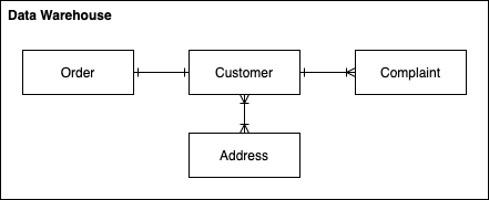
We can consolidate the 2 data models above into 1 consistent model such as:
Consolidated Data Warehouse Data Model
This would be the data model within our Data Warehouse where we’ve merged customer details (perhaps by performing some matching), performed some normalisation and defined relationships between the now common entities. It is much easier to query across 4 concise, defined tables, as opposed to 6 tables containing potentially duplicate data in varying formats.
Data Warehouses come with complexity – often they’re costly and complex to manage. Sometimes we just have large volumes of raw data (i.e. CSVs) that we want to analyse – this is the job of a Data Lake.
Data Warehouses and Data Lakes provide a location within which batch data can be stored and queried, however they’re typically not a great mechanism for reacting to data in realtime – this is the focus of Streaming Analytics.
Streaming Analytics
Unlike Batch Analytics where there is a defined dataset (i.e. we know the number of records), with streaming analytics there is no defined dataset. As such, if we want aggregate data, join data, etc. we must define artificial intervals at within which we perform analytics. For example, Congo want to know what products are hot right now (not the DJ Fresh kind) – ‘now’ could be defined as what’s being doing well over the past 30 minutes. Therefore, as customer orders come in, we might aggregate the quantity purchased for every product over a rolling 30 minute window. At the end of the window, we can use this data to understand what products are hot – perhaps storing the top-10 in a database available to our website so that these products can be shown on the homepage, promoting the sale of those products.
Sometimes we don’t want the results of our analytics to be sent back to another system, sometimes we want to display the results to a data analyst, or perhaps we want to show them the raw data and let them perform the analysis. This is the responsibility of Visualisation.
Visualisation
The most basic form of data visualisation is a Table, but as you can see from the image below, tree-maps, geo-maps and charts are all fantastic tools and only touch the surface of what is possible.
This is the end of the Reference Architecture section – now that the cookie-cutters are on the table, we can start making the cookie dough.
Congo Data Analytics on AWS
Congo have decided to implement their Data Analytics Platform in AWS using the Data Analytics Reference Architecture described above. In the diagram below, each component of the Reference Architecture is expanded to include the AWS technologies employed.
The following sections outline the high-level characteristics of each tool.
Ingest
In the Congo implementation, we utilise Kinesis Data Streams as the Ingest ‘buffer’ for data extracted from operational databases using the Database Migration Service.
Database Migration Service
Amazon’s Database Migration Service (DMS) provides a way of moving data from source databases such as Oracle, MySQL, etc. into a number of target locations such as other databases (sometimes referred to a sinks). In Congo’s case, they use DMS to perform an initial full load of the CRM, Order and Product Management systems and subsequently run CDC to feed ongoing changes into the platform. Congo extract all of their data using DMS onto a Kinesis Data Stream.
Kinesis Data Streams
Kinesis Data Streams is a messaging platform – instead of phoning up a friend tell them some news, you put that news on Facebook (i.e. a notice board) for consumption by all of your friends. Messaging systems typically help you decouple your data from its use.
The Database Migration Service will extract data from Congo’s operational systems and put it on the notice board (Kinesis Data Stream). In the diagram below, we can see that 5 ‘records’ have been added to the notice board.
Kinesis Data Streams is AWS’s high-performance, distributed streaming messaging platform allowing messages to be processed by many interested parties at extremely high velocity. For Congo, they provide a single place to make available ingested data for both Batch and Streaming analytics.
Kinesis Firehose
Kinesis Firehose provides a mechanism for easily moving data from a Kinesis Data Stream into a target location. In Congo’s case, we want to move the operational data that is available on a Kinesis Data Stream into the Data Lake & Data Warehouse for batch analytics. Data can either be moved as-is into the target, or it can be transformed prior to migration by a Lambda Function.
You may question how a tool can just move data from A to B. Kinesis Firehose must know what schema (the fields) is present on the Kinesis Data Stream and what the schema of the target is so that it can move the data from A to B in the correct places – this is the role of the Data Catalogue.
Data Catalogue
Glue Data Catalogue
AWS’s Glue Data Catalogue exists to allow easy integration with datasets held on both AWS (i.e. a Kinesis Data Stream) and external to AWS such as an on-premise databases. It is not in the same market as something like Kaggle which is consumer facing, providing data previews, user reviews, etc.
Glue Data Catalogue utilises processes known as Crawlers that can inspect data sources automatically to pull out the entities and attributes found within the datasets. Crawlers exists for database engines, files (i.e. CSVs), and streaming technologies such as Amazon Kinesis.
When it comes to using a tool such as Firehose to move data from a Kinesis Data Stream in a Data Warehouse, knowledge of the schemas can allow for automatic migration (i.e. by matching field names) or GUI based, mapping fields from dataset to another, regardless of field names (i.e. Glue Studio).
Batch Analytics
One of Congo’s use cases is to understand seasonal product trends such that they can improve their marketing strategy. This is achieved through Batch Analytics (analysing a known dataset quantity). Within AWS, Redshift provides Data Warehousing capabilities whilst S3 provides Data Lake capabilities.
Redshift (Data Warehouse)
Redshift is Amazon’s implementation of a Data Warehouse. At a high-level, it feels like a relational database and for all intensive purposes it is; it is exercised through SQL. But there are key differences to ensure query performance on extremely large datasets.
Behind Redshift is a cluster of computers operating in a Distributed Architecture. To distribute the data across these clusters, Redshift provides a number of techniques that will be familiar:
EVEN – each record will be assigned to a computer in a round-robin fashion (i.e. one after the other)
KEY – much like the clustering techniques described in this post, records with the same ‘key’ will be stored together on the same computer
ALL – all data will be stored on all computers
AUTO – an intelligent mix of all the above depending on the evolution of the data, size of the cluster, query performance, etc.
Whilst AWS provide a managed Data Warehouse solution, this comes at a monetary cost and may be ‘overkill’. In some cases, a Data Lake on S3 is more appropriate and in other cases, a mix of the two.
S3 (Data Lake)
This post will not go into detail about what S3 is, but for simplicities sake you can imagine it to be a file system much like what you find on your laptop – it is a collection of directories and files. As such, unlike the Data Warehouse which will manage the storage of your data for you, with a Data Lake we must split large files inline with the strategies outlined in the Distributed Computing section.
Congo have their Customer & Order information in the Data Warehouse and their Product reference data in the Data Lake (it doesn’t need to be processed prior to query and doesn’t change as much as Customer & Order information).
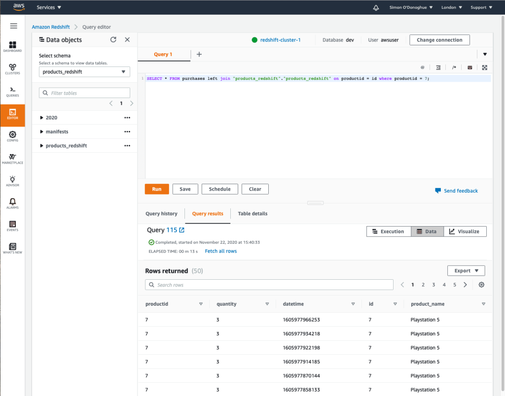
Athena & Redshift Spectrum (Batch Query)
Once we have data in a Data Warehouse and / or Data Lake, we want to query it. In its simplest form, Redshift is queried via Redshift and S3 is queried via Athena. As the AWS toolset has evolved however, this picture is becoming muddied. If you wanted to query data in your Data Warehouse and join it with data in S3, you could use Redshift Spectrum which allowed for this type of query. However, Athena is now supporting this use case in the other direction. I would not be surprised to see some merging of these toolsets in the near future.
An example of the Redshift Query Editor can be found below – the query is using Redshift Spectrum to join between a table in Redshift and data in an S3 Data Lake.
Both Redshift & Athena support JDBC and ODBC connections and as such, a vast number of tools can send queries to the analytics platform.
This leaves the problem of understanding what products are currently ‘hot’ – for that, we need Streaming Analytics.
Streaming Analytics
We previously discussed Kinesis Data Streams in its role as Ingest for Batch Analytics, but we can also use it as a source for Streaming Analytics and answer Congo’s ‘what’s hot right now?’ question.
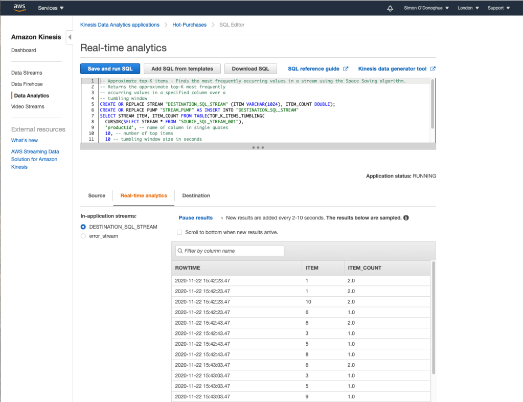
Kinesis Data Analytics (Streaming Query)
Kinesis Data Analytics can be thought of as SQL with Streaming Extensions. Kinesis Data Analytics can buffer based on defined windows, execute the analysis and push the output to a target system.
The query below is utilising a window of 20 seconds to determine the top-K (10) products sold within the window.
What can we do with the results of this streaming analysis?
Lambda
Kinesis Data Analytics can publish the results of the analytics to a number of locations including AWS Lambda – this allows us to essentially do what we like. For Congo, we want to make this analysis available to the Congo website so that hot products can be featured on the homepage – as such, we could publish these results back into an on-premise database accessible to the website.
Visualisation
Finally, visualisation. Sometimes the best analysis is performed by humans when given tools that allow the to slice and dice the data as we see fit – AWS QuickSight provides this capability.
QuickSight
QuickSight provides a more typical MI/BI interface such as those found in tools like Microsoft PowerBI – it makes querying your data more accessible than via direct SQL (i.e. makes your data accessible to non-technical resources) and more presentable than a simple table.
AWS QuickSight
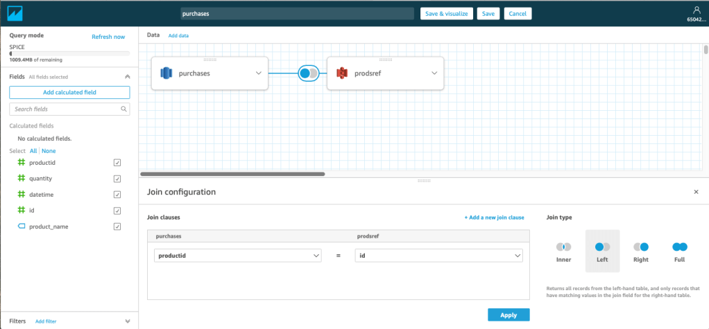
These datasets don’t have to be visualised independently, a table in Redshift can be joined to a dataset in S3 and an on-premise Oracle RDMBS. Through the use of the Glue Data Catalogue, joins can be made through a simple GUI.
AWS QuickSight – Dataset Join
But there’s more…
Data Analytics is a huge topic and there are an endless number of tools in the toolbox. AWS itself has much more than discussed in this post such as Neptune for Graph Analytics, EMR for Hadoop ecosystems, Data Pipeline for ETL, Managed Service Kafka (MSK) for long-term distributed streaming, ElasticSearch Service for search and SageMaker for machine learning.
Outside of AWS you have Data Analytics platforms offered by the likes Oracle and Cloudera. One of the main benefits AWS brings to Data Analytics is the massively simplified management – managing a 20 node Apache Hadoop cluster is not easy and finding the people with the skills to do so is equally as challenging. AWS removes this complexity, at a cost.
Twitter is a platform of over 340 million users, producing over 500 million tweets each day. Even just an insight into 1% of those tweets has the potential to provide a decent understanding into what’s happening in the world. If something is in the public domain, it’s on Twitter.
This post explores a technique to digest tweets down into a data structure that allows for user interaction, breaking story identification or even brand sentiment analysis.
The process begins by processing data from Twitter – for-which there are a number of approaches.
Data Processing
Data can be processed in many ways – two common to analytical processing are Batch & Stream Processing. At a high-level, the distinction is that with Batch Processing, the dataset for processing exists before processing begins. With Stream Processing, the dataset is not known ahead of time but instead arrives ‘bit-by-bit’.
Batch Processing
Batch Processing is the most common technique deployed for analytical workloads – perhaps each evening you want to take the days sales from your store and identify trending products, or perhaps you want to analyse the output of a collection of sensors following a rocket test to understand mechanical stresses that are felt across the vehicle. Batch Processing takes a defined amount of data as input at a specific time (t) and performs a series of actions upon it to create an output after-which processing ends.
However, sometimes we don’t want to wait for the entirety of the dataset to be available before we start processing it. Perhaps it’s not possible to have the entire dataset available prior to processing as the data does not yet exist. Regardless, the questions we ask of our batch datasets we could also ask to a more realtime flow of data – this is achieved through Stream Processing.
Stream Processing
Whilst not necessarily a new approach to data processing, Stream Processing is the processing of data whereby the dataset is not a known quantity. There could be 5 pieces of data to analyse or 5,000,000; 3 pieces of data could arrive each second most of the time, and at other times 5,000 pieces of data could arrive each second. Stream Processing allows us to process data as and when it arrives in a realtime manner.
In the rocket example, we analyse the sensor data as values are produced, not once the test has finished and all sensor outputs collated. This allows us to make decisions during the test as opposed to afterwards which could be useful if we’re looking to avoid an unplanned disassembly!
With Batch Processing, as the dataset is known ahead of time, the input can be split and assigned to compute resources ahead of execution – an execution plan can be created (if interested, read into MapReduce). With Stream Processing, we’re a lot more reactive and as such these architectures can often seem more complicated. However, as you should see in this post, that isn’t always the case and shouldn’t put you off.
Given we want to process tweets in realtime, it seems we need to implement a form of Stream Processing to meet our requirements.
Twitter Streaming
It turns out Twitter have an API to stream a 1% sample of tweets – the question then is given this information, how do we make sense of it?
Extracting Knowledge
I wanted to focus on two core elements when processing tweets – relevance meaning exposing words that ‘mean something’, and confidence meaning how relevant words come together to confidently outline a story.
I’m no linguistic expert, but let’s work through an example:
Fantastic goal from Mane this evening
From this tweet, the words ‘fantastic’, ‘goal’, ‘mane’ and ‘evening’ are relevant to understanding what’s happening. The words ‘from’ and ‘this’ whilst meaningful, are arguabley not as useful for my use case, they’re typically known as stop words. Furthermore, these extremely common words will be found in many tweets not relating to a goal scored by Mane, so it’s probably best we discount them in our analytics to avoid noise.
Secondly, confidence. If one person tweets that Mane has scored are goal, are we confident that he has? Probably not. If 50 people tweet Mane has scored a goal, I’d argue it’s likely that he has. This is the approach I have taken. There are obviously other techniques such as trusting some Twitter accounts more than others – much like how backlinks work within search engine indexing algorithms.
Correctness is also worth a mention, particularly in todays world. It’s not something I’ve tried to guard against in this piece of work as my primary goal is not to present correct information, just information that’s ‘trending’ on Twitter (at a level of detail that does not rely on hashtags).
Once we’ve received data from Twitter, we’re going to need a data structure to support our use case so we can programmatically record relevance and confidence.
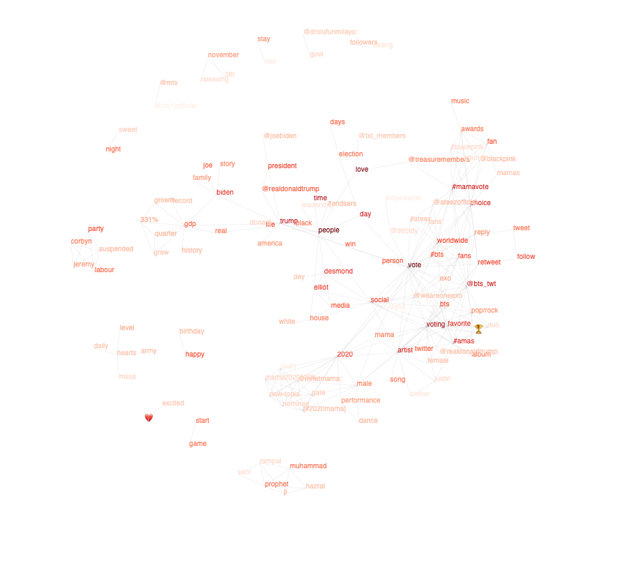
Synaptic Graph
Again, that common data structure, the Graph, provides the mechanism to store the analysis. A visual example can be seen below.
The boldness of the words depicts how often the word is mentioned in tweets and the lines indicate an association between words that meets the given confidence criteria.
You will be able to see some stories in the above graph, but let’s look at some examples in further detail.
Examples
Unfortunately, the week of testing was not a particularly great one for the world and so I apologise for using such sensitive events in my analysis.
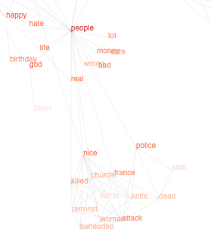
Nice, France Attack
The recent events in Nice, France appeared in the analysis. Initially ‘nice’ and ‘attack’ became apparent on the graph, swiftly followed by more details of what was happening on the ground as people began to tweet.
You can see from the boldness of the text that we’re pretty confident there’s been an attack in Nice, France and that the Police are involved. Details are emerging that it could be terrorist related and that the police are associated with a shot. However this exemplifies an issue with this data structure – it appears the police have shot someone dead.
It may be that early tweets were suggesting that the police had shot someone dead and the correctness issues outlined earlier becomes apparent. Or perhaps the tweets just contain information about the police attending an incident where people had died and the police had fired shots. The graph records useful, relevant information, but it isn’t a source of truth.
US Election
As you would expect, the US election is accounting for a large quantity of tweets at present.
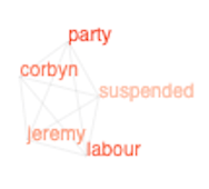
Labour Party
The recent EHRC report into the Labour Party reported that Jeremy Corbyn was suspended from the party.
Depending on the tweets provided within the 1% sample stream, you can end up with separate graphs which whilst related in the real world, have not yet been connected through analysis. This can be seen opposite. As processing continued, a connection was formed between these two graphs.
Conclusion
I mentioned at the start that Stream Processing doesn’t have to be complicated – this proof of concept used client side Javascript and Google Chrome to open up a persistent HTTP connection, processing 70 tweets per second. If you’re trying to solve a data analytics problem, don’t feel it’s out of reach and you need to stand up an Hadoop cluster. Start small and you’ll be surprised at how much you can prove and achieve.
For me, this project will continue and I’ll report back on future versions. My efforts will focus on weeding the graph of old news over time, refining the deletion of stop words and perhaps overhauling the UI altogether. If you have any ideas, please let me know.
Disclaimer: I am not working on the UK Coronavirus Contact Tracing App – this is my own analysis and thoughts.
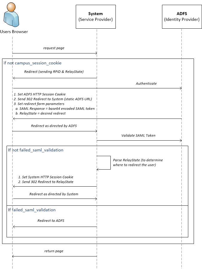
Contact Tracing apps are appearing in the news almost daily – they’re seen as one of the key enablers to reducing lockdown measures. But how do they work?
If these apps are going to be the number 1 app in App Store’s over the next year, I think it’s important people know how they work. This post attempts to offer you an explanation.
I am not working on any contact tracing applications but I have the upmost respect for those that are – as this article will highlight, this isn’t about software engineers sitting down at their keyboards. This involves the collaboration of politicians, health professionals, law professionals, engineers (across hardware and software), and more. Thank you.
So how do you collect 40TBs worth of data and spend £3m in the process?
High-level Architecture
Architecture 101 will teach you about the 3 Tier Architecture – at the top you have a Presentation Tier interacting with your users and at the bottom you have a Data Tier storing the data generated by the system. In the middle you have an Application Tier plumbing both layers together.
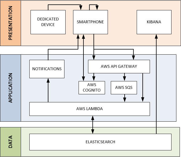
My theoretical Contact Tracing app has the following architecture. Don’t worry – each box in the diagram below will be explained throughout this post.
Presentation
The Presentation Tier is the window into the Contact Tracing app for end users – whether that be you and me on our phones or professionals using dedicated tools. There are 3 core components:
Smartphones – the primary tool in determining whether 2 people have come into contact and upload this information to a central server. It also allows users to report any symptoms they may experience to warn other users that they need to isolate.
Dedicated Devices – for those that do not have smartphones, cheap devices with extremely long battery life can be distributed to also track person-to-person contact.
Kibana – a tool to enable the professional community to analyse the data collected.
The remainder of this section explains these components in further detail.
Collecting Contact Report Information
A Contact Report is data describing the coming together of 2 people. But how do you know if 2 people are near each other in an automated, omnipresent way? Radio.
Smartphones use a lot of radio – when you make a cellular phone call, send a text, stream Netflix over your WiFi or download health data from your smartwatch via Bluetooth. But which radio technology is best suited to determine when 2 people are near each other?
Bluetooth LE
Bluetooth is the technology of choice – it operates in the 2.4GHz radio spectrum but at a much lower power than cellular and WiFi meaning it’s 1) friendlier to your battery, and 2) localised. If we can use Bluetooth, what information do we need to transmit to determine whether or not 2 people have passed each other?
We may be familiar with the terms IP, TCP, etc. these define a stack of protocols that allow us to send data across the Internet. But they’re not applicable everywhere – they’re quite heavy. Transmitting data in a Bluetooth environment does not have the same complexity as transmitting data over the Internet. Just as motorways have barriers, emergency telephones, etc. the street you live on doesn’t – different protocols are used in different environments. In Bluetooth, the important protocol to discuss is GAP.
GAP defines 2 types of devices, a Central and a Peripheral. A Peripheral has some data to offer – your smartwatch for example is a Peripheral in that it can tell your phone what your heart-rate is. The device looking for this data is therefore the Central. This relationship doesn’t have to be read-only, centrals can also write. For the sake of a contact tracing app however, it only needs to read.
A Central device is made aware of peripheral devices through advertisements packets – they’re like the person outside the airport holding your name up on a sign. The Advertisement Packet can merely inform the central of the devices presence, or it can contain additional information such as a name, the services it offers, and other custom data.
We can start to see how this may work – I’m walking along the street and my Bluetooth radio is listening across the various Bluetooth advertisement RF channels (of which there are 3), looking for other devices. Given the power at which Bluetooth signals are transmitted by the antenna on a device, it’s safe to assume if you pick up an advertisement packet, you’re within a stones throw of the person (ignoring walls, etc. – a concern raised regarding the reliability of contact tracing apps). We’ve detected an advertisements packet – great! How do we turn that into something useful?
Other contact tracing applications such as CovidSafe will connect to a device upon discovering a peripheral via an advertisement packet. Once the connection is made, it will read data from the device. This requires a fair bit of radio communication which would be nice to reduce. Furthermore, if the 2 devices can’t connect because the receiver signal strength is below the radio sensitivity (after all, they are walking away from each other and Bluetooth is short range), we’ve lost the contact even though we knew they were in the area as we saw an advertisement packet! Can we include some identifying non-identifying information in the advertisement packet that maintains privacy and reduces radio communication?
Every Bluetooth advertisement packet is sent with a source and destination address. Imagine you had the address 123, if somebody else knew that, they’d have a way of tracking you within a 15 meter radius over Bluetooth. That’s not good. To prevent this, the Bluetooth LE spec recommends periodically changing the address to avoid the highlighted privacy concerns – which Bluetooth chip manufacturers thankfully abide by. So we can’t use the Bluetooth address to identify a user as it may change. What other options do we have in the Advertisement Packet? (Identity Resolving Key (IRK) is a mechanism to remember devices – i.e. so you don’t have to keep reconnecting your watch!).
A developer can add up to 30 bytes of custom data to a Bluetooth advertisement packet – that data can be categorised inline with the Bluetooth specification. Within frameworks such as Apple’s Core Bluetooth, developers are limited to setting a device local name and a list of service UUIDs. Each Bluetooth application on a users phone can transmit different advertisement packets. By setting the device local name to an ID that means something in the context of the wider contact tracing application, we’ve a way of identifying when 2 people have come into contact. That thing is a Contact Token.
Contact Token
Every device in the contact tracing ecosystem has a unique identifier, often known as a Device UUID. This is a static ID – mine could be 1234. It contains no personal information but is unique to me. That’s great, but I can’t advertise that indefinitely or like the problem Bluetooth is trying to solve with the ever changing addresses, I can be tracked! This is where a Contact Token comes in.
A Contact Token is a somewhat short-lived identifier (couple of hours) that the Contact Tracing app knows about (i.e. it knows what user is using the token) but that other Bluetooth devices only know about for a couple of hours before it changes (therefore meaning you can’t be indefinitely tracked). You may recognise someone in a crowd from the clothes they’re wearing, but when they change their clothes the next day, you’ll have a hard time spotting them in the crowd.
Each device advertises a Contact Token once it has registered it with the application server (more on that later). When a device receives an advertisement, it informs the server that it has come into contact with the token, sending the token of the remote device, the local Device UUID, and a timestamp. On server-side, the contact token is correlated to the remote Device UUID and stored.
To prevent the user from being tracked, the Contact Token must be refreshed. But we’re talking about 48,000,000 people – we can’t do this every minute, the Transactions per Second (TPS) would be too high (think of TPS as frequency – I can ask you to do a push-up every second for 10 minutes, but you won’t be able to keep it up for long, I’d need to lower the frequency). If we change the token every 3 hours, we achieve a TPS of 4,000 – acceptable.
So that allows us to send a Contact Report to the contact tracing app backend systems and respect privacy – but when do we send these reports? As soon as they occur?
Sending Contact Information
Once we’ve identified a contact, we need to send that data to the server. But much like the TPS issues identified regarding the Contact Token – when sending contact reports, the frequency is increased by a factor of 10! Why? We walk past a lot of people each day!
In a typical day at work, I would imagine I walk past at least 100 people. A typical walk to work takes 10 minutes and I probably walk past a person every 10 seconds. That’s 60 people and the day hasn’t even started.
If there are 48,000,000 people utilising the app daily – you can imagine the volumes. 4,800,000,000 contacts per day across the population. Not only that, they probably occur over a 12 hour period between 0700 and 1900.
That’s a TPS of 111,111… ouch! No system can handle that. How can we reduce it? Batches.
Apple and Android support background execution of applications, however to preserve battery life, there are limitations. Whilst you can’t ask your app to do something every 2 seconds, there is support for Bluetooth ‘events’ – whenever an advertisement is received, your application can process it in the background. As contacts are discovered, we can add them to a cache and once that cache reaches a certain size (let’s say 50), it can be flushed to the server. This would result in a TPS of 2,222 – acceptable.
However, there are drawbacks. What if we have contacted 49 people and are then at home where we see nobody – those contacts will not be flushed to the server until the following morning when we venture outside and walk past 1 more person – this could result in delayed isolation notifications as the central system does not know of contact reports. Whilst some of these contacts may have been registered by the other person (you see my advertisement and I see yours), they may not have. Is this acceptable?
How do we handle contacts from coworkers and family members whereby we’re with them most of the day? To reduce the load, as Contact Token are replaced every 3 hours, we can cache the token and if we have already encountered it, refrain from sending the contact to the server.
Importantly, these decisions are not just technology based, they require input from politicians, health professionals, and more. Furthermore, they may be dynamically tuned during the live operation of the application.
Reporting Symptoms & Receiving Warnings
When a user reports that they have symptoms, all contact with that user in the past N days will be retrieved from the database. Each contact will then receive a notification (i.e. via the Apple Push Notification Service and Android equivalent) informing them to stay at home. How far we distribute these notifications is largely based on the R0 of the virus – the average number of people an infected person will infect. You can see a very simplified probability tree below where a single person is infected in a population of 13; infections can only traverse the lines between the circles. Furthermore, it is true that R0 is 1 for each population of 4 people (i.e. in a group of 4 people where 1 is already infected, 1/3 of the uninfected people will be infected).
At what breadth do you stop sending isolation warnings? Health professionals would have to decide, based on the R0 of the virus, at what probability they’re willing to stop sending notifications (too many notifications and people won’t trust the app is reliable). The R0 in the UK is approx. 0.5 and 1.
Apple & Google Frameworks
One of the main issues I see with current implementations of tracing apps is background execution. An app is considered in the background once it has been opened and the user then returns to the home screen without ‘swiping up the app’ (on iOS). However, many users frequently close their open apps, meaning the app will not be in the background and listening for or advertising packets over Bluetooth. This is where I would like to see improvements made in the frameworks Apple and Google are currently working on (although they’re taking it a step further).
Dedicated Device
What about those who do not own a smartphone? How might they participate?
As the name states, Bluetooth LE is Low Energy – embedded devices running off coin batteries can last for days to months. A potential solution therefore is a cheap, embedded device that can be distributed and integrated with the system.
I have created a basic proof of concept using a SmartBear BLE Nano board which can be seen below.
This device only has Bluetooth capabilities (to keep power consumption at a minimum), so how does it upload contact report information to the server and how are owners of these devices informed when they’re asked to isolate?
We know that receiving an advertisement packet is the trigger to upload a contact report to the server – in the smartphone example, given one of the devices receives an advertisement, the contact will be uploaded to the server. But in this case, if only the embedded device receives the advertisement, the contact won’t be uploaded to the server as there’s no radio providing internet connectivity.
A potential solution is to cache these contact reports and only when the chip can maintain a solid connection with a smartphone does it transfer this data to the phone which relays it to the server (ensuring to take care of man-in-the-middle attacks).
What about receiving isolation warnings? As is explained later on in this post, users verify their accounts via SMS. When a user receives their embedded device, they register it online, providing the system with a telephone number. A message can then be sent to the number if they are required to isolate.
So that’s the process from contact to sending the contact report to the server. Once the data is persisted centrally, we need a mechanism to make sense of it. Kibana.
Analysing the Data – Kibana
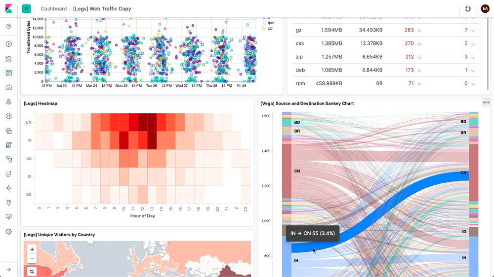
Kibana is a data exploration, visualisation and discovery tool. In other words, it allows people to make sense of large quantities of data in a somewhat user-friendly way.
Utilising Kibana, professionals in their respective disciplines can slice the data to understand a myriad of metrics that will aid in the decision making processes to enable the country to return to normal in a safe and controlled way. It can help answer questions such as:
Where are infections occurring?
Are people who receive isolation warnings actually isolating? (i.e. is our strategy effective)
R estimation validation
Immunity – are people reinfecting?
Application
The Application Tier is what ties the data collection in the Presentation Tier with the persistent, centralised storage of that information in the Data Tier. This Blueprint focuses on a serverless AWS architecture given the execution environment (12 hours of immense usage followed by 12 hours of very little usage), however solutions in other cloud and non-cloud environments are possible.
There are 2 types of inbound transaction (ignoring sign up, etc.) the Application Tier must support:
Registering a Contact Token – the user device must receive a response from the Application Tier before it can start advertising a Contact Token. It has a TPS of approx, 3,000.
Report Contact – the user device informs the Application Tier of a contact between 2 people. It requires no confirmation. It has a TPS of approx. 2,000.
However before we send any of this data, we need to ensure it’s coming from someone that we trust.
AWS Cognito
Privacy is double-edged sword – on the one side it protects the user, but on the other side is has the potential to degrade data quality and subsequently user experience. If users can sign up for a service without verifying themselves in any way, those with malicious intent will take advantage. There are a number of ways to prevent this through verification:
Digital Verification – Email / Phone Verification, but also image recognition to match a taken picture against a driving license picture, etc.
Physical Verification – attending an approved location with ID
Given the environment, this solution utilises SMS verification – whilst the details regarding the owners of numbers is private, this information can be accessed through legal channels and may violate some of the security principles.
AWS Cognito is the PaaS Identity Management platform provided by AWS. It’s where users validate their password and in response gain access to the system.
AWS API Gateway
Once the user has authenticated with AWS Cognito and received permission to access the system (via an access token) – they can use this token to make authenticated calls to the API Gateway. The first transaction will be to register a contact token.
When communicating with the API Gateway to register a Contact Token, the message is synchronous meaning the user (or more specifically, the users phone) won’t advertise the contact token until the AWS API Gateway has said it’s OK to do so. The Contact Token will be stored in the database before a response is returned to the user. An AWS Lambda function will handle this request and is explained further on.
Unlike the synchronous contact token transaction, we don’t need to wait for the contact report to be added to the database before our phone can continue with its business. Rather, as long as the AWS API Gateway says it has our contact report and will handle it, we can trust it do so. This is known as asynchronous communication. This asynchronous communication can be mediated through the use of queues – and as if my magic, AWS have an offering – the Simple Queue Service (SQS).
AWS Simple Queue Service (SQS)
As has already been alluded to, volumes in a system such as this are huge. Even with batching contact reports (remember the groups of 50), we would still produce 96,000,000 messages per day. If each message takes 0.5 seconds to process, that’s 13,333 hours if processing them sequentially. We need a place to store contact reports so we can process them in parallel – this is where SQS and AWS Lambda come in. Queues allow work to be dropped off somewhere with a fast TPS to be picked up and processed by systems with a slower TPS.
For now, think of Lambda as the ‘code’ (known as a Lambda Function) that takes contact reports off the queue and stores them in the database. If we can run multiple Lambda Functions in parallel, we would reduce our elapsed execution time. You can execute up to 1000 Lambda Functions in parallel which takes our elapsed execution time to 13 hours. That seems to work, but can we improve?
If we take batches of 10, so 10*50 and assume 1 second to process, it would take 1000 parallel Lambda Functions 3 hours to clear the queue. Often time, that majority of the execution time is not the business logic, but the overhead of spinning up of the environment, etc. to process the batch.
Whilst the queues may be empty during the night, during the day the queues will ensure end user devices can send contact reports to the server, regardless as to how busy it is. Thankfully, AWS state SQS Simple Queues support an almost unlimited TPS!
Continuing with the serverless theme, processing of messages on the queue is performed by AWS Lambda.
AWS Lambda
Lambda is the logic engine of the Application Tier – 3 Lambda functions will perform the following:
Register Contact Token – in response to synchronous API calls through the API Gateway, this Lambda will store the token in the database.
Report Contact – through polling of the SQS queue, this lambda will take contact reports, resolve the contact token to a user and if not a duplicate (i.e. the other user has already registered the contact), add store the contact report in the database.
Notify Infection – upon receiving a verified infection report, this Lambda will inform all recent contacts that they meet defined criteria to isolate.
Health professionals will also need to decide what do with a user who has reported an infection and continues to participate in the population? This will require even more logic, perhaps when registering a contact to check whether the contact is already infected and triggering the notification process (perhaps ensuring those who were previously informed are not informed again).
Data
Finally, the Data Tier where we store 40TB worth of data.
Firstly, this section attempts to explain the difference between centralised and decentralised contact tracing apps. Secondly it explains the volumetrics – how do we get to the 40TB figure? Finally, it explains the database choice, Elasticsearch.
Centralised vs Decentralised
One of the main areas of contention when it comes to creating Contact Tracing applications is storage. Should all the data be sent to some central database owned by an organisation (the UK Government, for example), or should data remain on end user devices in a decentralised way (note decentralised does not mean Distributed Ledger or Blockchain!).
The main concern regarding centralisation appears to be privacy – do you want the government to know where you are / have been? Well, that’s a myth in my opinion. Given a design such as the one used here, even with a centralised model, the central organisation cannot easily track known individuals. At least not without going through existing legal channels to resolve telephone numbers to identified individuals.
With a decentralised solution – a device may maintain a list of all contacts. When a user reports they’re infected, this could be broadcast to all devices to check their local cache – if they’ve come into contact with that person recently, they will be asked to isolate.
With a decentralised model, data analysis becomes almost impossible. However, once the data is centralised, it comes incredibly useful to a wide range of professionals.
The UK Government is aiming for a centralised model, and I couldn’t agree more.
Data Model & Volumetrics
What data are we going to be storing? We essentially have 2 data types:
Contact – this is a user, it will include information such as their User ID, whether they’re infected, how long they’re in quarantine for, etc.
Contact Report – the two contacts who came into contact, where and when the contact occurred
The volumes involved in the contact information is negligible (GBs), however, as you can imagine, it is not so negligible for the contact reports.
Let’s define a contact report as
User A – 16 bytes
User B – 16 bytes
GPS – 16 bytes
Timestamp – 4 bytes
Each contact report consists of 52 bytes.
If there are 48,000,000 people using the app daily resulting in an average of 50 reports per user ending up in the database (100 contacts per day, 50% duplicate reports) and each contact report is 52 bytes, in a year that will generate approx. 40TB worth of data!
This data needs to be stored somewhere where it can be efficiently stored and queried.
Elasticsearch
In deciding on the database, I was looking for extreme retrieval performance. Naturally a GraphDB such as Neo4j jumps out – after-all, logically contacts are just vertices and edges. However, when the Neo4j data-size calculator told me I had too much data – I was concerned. Furthermore, the master / slave architecture of Neo4j (all writes must occur on a single node) is concerning.
The alternative is Elasticsearch – a distributed data store built of indices that are stored on shards across a number of nodes. This distributed nature allows for distributed querying across the dataset, outperforming any other database on the market. Furthermore, the integration with Kibana to analyse the data provided an unrivaled end-to-end package.
So that’s it – we’re done. Now for the final question – what will it cost?
Cost
Ignoring the people cost, I’ve estimated the technology cost as follows (high-level estimates based on simplified AWS pricing).
Service
Cost per Day ($)
API Gateway
556
SQS
38
Lambda
19
Elasticsearch Servers
100
Elasticsearch EBS
80
Cognito
4,000
Total
4,793
Therefore, it’s approximately $143,790 per month, or $1,725,480 per year. There are also SMS costs to verify users, totaling $1,866,240 for the required population.
That’s a 1st year cost of $3,661,720, or £2,938,640.
Conclusion
Creating a Contact Tracing app is not as simple as making that Bluetooth.startAdvertising() call on a mobile phone. The call sets into motion a wealth of complexity that can only be solved by the amazing collaboration of engineers, politicians, medical professionals, and mathematicians to name a few.
Choosing between a centralised and decentralised solution has major implications as highlighted throughout this article. However, I believe the advantages of being able to analyse this data greatly outweighs the technical complexity and privacy concerns.
There are 500 million tweets a day – a contact tracing application has the potential to report on almost 5 billion contacts a day. These volumes are unparalleled and in my opinion can only be met through a serverless cloud architecture such as the one outlined in this article (although this took me a day to design so it’s probably full of holes!).
What are your thoughts? Is centalisation worth it? How would you improve on this solution? Is it worth £3m?
Computer Algorithms are not magic – they’re a defined set of instructions set out by a Software Engineer to achieve a certain goal. The goal of LeetCode problem 675 is to cut down trees in a forest, cutting the trees in ascending order and counting the minimum number of steps required – the ‘difficulty’ comes through obstacles in the forest that you cannot walk through, potentially preventing you from cutting down the tree’s.
In the video above, the obstacles are depicted in the grey colour. Within the force-directed view, a red node indicates the current starting position and green indicates the next tree we’re heading for (note how green becomes red as we walk to each tree and cut it down). A purple node indicates the ‘frontier’ of the BFS, whilst pink nodes indicate those nodes we have already visited in the search. All others nodes are blue.
The video is just a snippet, head over to the demo site to view from start to finish.
Producing this visualisation was surprisingly simple – D3 is used to create the force-directed graph you see on the left, and Three.js is used to mimic the ‘forest’ we’re trying to chop down. The most complicated part of the solution is structuring it in such a way that the algorithm execution can be ‘slowed down’ and visualised; this was achieved through a mix of JavaScript Intervals and Promises. The code can be found on GitHub – it was put together in an afternoon so please don’t judge!
So what next? Debugging is typically performed in an Integrated Development Environment (IDE) – however, for a lot of new and aspiring Software Engineers, this environment can be difficult to navigate. What if we could debug in an environment that we are all accustomed to – a highly visual, interactive environment. This is the purpose of the next stage of this piece of work (if I can find the time!) – I will release this LeetCode problem as an integrated web based IDE that visualises your code as it executes. Will you implement a BFS solution, or perhaps a more heuristic solution such as A*?
Workflow Automation is nothing new on iOS – one of the most popular workflow apps of 2016/17 was an app named ‘Workflow‘. In fact, it was so popular that Workflow was purchased by Apple in 2017 for an undisclosed amount.
The app was re-branded as Apple Shortcuts and may be one of those Apple Apps that you file away in an ‘Apple’ folder and never touch. But hopefully by the end of this article, you will not only understand the architecture behind Apple Shortcuts, but having been taken through the development of a real-world shortcut (integrating with Trello), you will have the knowledge to dive straight in and start creating your own shortcuts. Whilst this article focuses on iOS, Android has a similar offering, Google Action Blocks.
What is (was) Workflow?
As with any Operating System (OS) environment, frameworks are provided to developers to enable them to complete common tasks. For example, on OS may provide frameworks to allow developers to record audio, manipulate an image, or send a text message. As an iOS Developer, you’ll often integrate with these frameworks provided by Apple. Fundamentally, these frameworks expose functions that can be combined together into a workflow (a sort of simple app) in adynamic way (i.e. they don’t require the user to create an app and release via the App Store). This was the idea behind Workflow and is shown below:
Action Types
Workflow essentially exposed wrappers around these common functions (and created some of their own reusable actions that do not use underlying Apple frameworks – such as handling variables, rounding numbers, etc.). Through a slick UI, the app allows users to combine these actions together to create a workflow, passing the output of actions as the input to subsequent actions.
For example, you may have a workflow that gets all photos taken today from the users camera roll and creates a pre-populated text to send to your family with the images attached. Prior to Workflow, this could not be automated with out of the box iOS functionality. But with Workflow, this is possible and opens up a whole new genre of apps, or more generally, consumer automation opportunities.
It’s obvious to see why Apple decided to make such an acquisition, especially when you see how they’ve integrated it into the Siri ecosystem over time, as the following section explains.
Apple Shortcuts (Intent Framework)
It’s great that the Workflow developers could write ‘wrappers’ around iOS frameworks and expose them to users in the Workflow app, but what about integrating with other applications on the App Store? They don’t come as iOS frameworks, but they contain useful actions we may want to combine into a workflow. We also don’t want the developers who work on the now Shortcuts app having to write a wrapper around every possible application out there to enable it to be combined into a Shortcut workflow. The answer is a layered architecture.
To a Software Engineer, the concept behind Apple Shortcuts makes complete sense. Applications consist of a number of functions (or Actions as Shortcuts refers to them) – you book taxis on the Uber app, order drinks on Starbucks App, post pictures on the Instagram app, etc. As a Software Engineer, we see this as a layered architecture consisting of Presentation, Application, and Data layers. The Application Layer consists of business logic that can be reused across a number of presentation technologies (GUI, voice, workflow, etc.). This is the concept behind Apple Shortcuts, whilst Starbucks allows you to order a coffee via their App, you can also set up an Apple Shortcut that will order you a coffee from Starbucks as soon as you leave the house, without you ever having to open your phone.
Intent Actions
The way in which Apple allow apps to expose reusable ‘Actions’ is via the Intent Framework; the framework originated to provide Siri with a way of interacting with applications (i.e. get the latest headlines from the BBC News App). This architecture can be seen below:
Intent Architecture
The Application (Business) and Presentation Layers are explained below:
Business Logic (Application Layer) – regardless of the way the user interacts with the application, the goal of the user is the same – this is the business logic of the application. For example, the goal of a user interacting with Uber is mostly to book a taxi. In order to do this, a number of parameters must be specified, such as:
Pickup location
Destination location
Type of taxi
Billing Information
Application View (Presentation Layer) – this is the Uber App you’re used to interacting with – the interface that allows you to interact with a map to set pickup and destination locations. The Application View passes parameters selected by the user using the User Interface to the Business Logic to book a taxi. Note that the Business Logic does not care how the parameters are retrieved from the user, just that they’re provided. For example, they could also be proved by an Intent.
Intent (Presentation Layer) – an Intent is another form of user interaction whereby the interaction is not via the ‘App’ but via either Siri or Shortcuts. Much as the UI provides a way for the user to input parameters to invoke some Business Logic, an Intent also collects parameters, passing them onto the reusable Business Logic. Depending on the channel used by the intent however, the approach will vary:
If using Siri, the user may converse with Siri (through voice, cards, etc.)
If using Shortcuts, the input parameters may be preset by the Shortcut definition, or the user my be prompted as part of Shortcut execution.
Siri, a Personal Assistant
Shortcuts is integrated even deeper into the Siri ecosystem with a learning path going from business logic execution to the Siri Recommendation Engine. Siri is an Artificial Intelligence (AI) agent – it aims to learn about you to provide a more tailored experience. Run the shortcut ‘Book taxi’ every morning? Siri will learn that you do this Monday – Friday and present you with the ability to run the Shortcut from your lock screen in the mornings, Monday to Friday. This is achieved through the Siri Donation System.
Over the Christmas break, I wanted to learn more about Apple Shortcuts and so came up with my own Shortcut. I run my day-to-day personal and work tasks through Trello – each morning I’ll open the various boards to see what’s due today (and often what’s late!). It would be great if, upon turning off my alarm in the morning, Siri would read out this information to me.
Shortcut Tutorial
Before we get started, it’s important to understand what makes up a Shortcut. In my opinion, a shortcut consists of three ‘structures’:
Flow Control – if you’re going to create something that executes a series of events, you’re going to need to make some decisions on what to do. That’s where Flow Control comes in; this essentially boils down to if statements and loops – statements that control execution.
Apps – whilst a Shortcut doesn’t need to interact with Apps on your Apple device, often times it will. Examples include Trello, Google Maps, Starbucks, Photos, Messaging, etc. These actions are exposed via the Intent Framework described above.
Functions – your Apple Device will expose a number of functions provided by the Operating System, this enables you to do things such as make API calls, perform base-64 encoding and decoding, and parse text.
The above combine to create the “What’s on today?” Trello Shortcut – however, they can be combined in a number of ways. I considered two approaches, starting with Native Trello REST API Integration.
Native Trello REST API Integration
Initially, I wanted to see if an approach to calling REST APIs would be successful; whilst the Workflow developers have already written Actions that call the Trello REST APIs, I was interested to see how easy it would be to integrate via REST myself. How easy would it be to integrate with any REST API out there on the Internet?
REST API calls are made through the Get Contents of URL Action – you provide an endpoint as well as a method, headers, and in the case of POST, PUT and PATCH, an optional request body. The response can then be parsed (particularly if it’s a JSON response), often by sending the response to the Get Dictionary from Input action.
I was also interested to see how complex the responses could be; could I return some audio generated by AWS Polly and returned via Lambda to be played back on the iOS device?
The architecture is outlined below:
What’s on Today? AWS Architecture
Architecturally, the solution worked. Lambda would make a call to the Trello REST APIs to retrieve cards, formulate the textual response and request AWS Polly to turn it into speech. This audio would then be base64 encoded and returned as the payload. The Shortcut would then decode then base-64 decode the response and send this to the Play Audio action. It has proven to me just how much potential there is to be achieved by Apple Shortcuts.
However, due to poor support for POSTing JSON (essentially serialisation of lists – the list is parsed into a string separated by new line (‘\n’) characters as opposed to an array of objects), I decided to follow the Trello Shortcut Action architecture explained in the next section.
One point of note if you choose to implement this architecture – AWS Lambda has a 6MB restriction on response payloads. If you’re sending the AWS Polly audio file as a base64 encoded string, you may quickly breach this limit. In this instance, you’ll need to use Amazon S3 for delivery of the audio file to the device (i.e. Lambda returns a Presigned URL).
Trello Shortcut Action
Prior to Apple purchasing Workflow, the developers had created a wrapper Action around the Trello REST API that will OAuth (authenticate) with Trello and enable you to query boards, lists, and cards (you can also create Trello items). The response from the Action works perfectly with some of the Flow Control structures in Shortcuts such as the ‘Repeat with Each’ action.
I created the below Shortcut to retrieve items from my Personal Development Board and utilised Siri to verbally tell me what cards are overdue and due today.
What’s on Today? Shortcut Definition
The solution works great, however due to restrictions of the Trello Action, it is not possible to dynamically select a list (i.e. to loop through all boards). This prevents you from creating a shortcut that will loop over all cards across all your boards (which I would find useful).
You can download the Shortcut and modify it as you see fit – what additions would you make?
I also wanted to automate the way in which the Shortcut would trigger – one of the enhancements Apple has made to the Workflow app in Shortcuts is the ability to automate the triggering of a Shortcut.
Siri will learn when you use certain shortcuts and can recommend them on your home screen for your to trigger manually; however, shortcuts can also automatically trigger upon location conditions, alarm conditions, and certain device conditions such as a Bluetooth device connecting. For the context of the “What’s on Today” Shortcut, I wanted Siri to read out the things I had to do today when I turned my alarm off. The automation below achieves that.
Shortcut Automation
Future Improvements
In the 2 years Workflow has been under the control of Apple as the Shortcuts app, a number of key improvements have been made – specifically integration with the Intent Framework and support for Automation. Through the creation of the “What’s on Today?” Shortcut, there are a number of improvements I would like to see which are outlined in this section.
Type System Stability
The Type System within Shortcuts is what enables you to retrieve the attributes of objects that are the result of an Action. Unfortunately, actions cannot always correctly determine the type of an input if the action does not come immediately after the action that produced the relevant output.
In the example below, the Repeat and If blocks were added sequentially following Get Trello Items where the type system works correctly. However, above the Repeat block a Speak action was added, making the Get Trello Items and Repeat blocks disjoint. Therefore, when adding the Time Between action, I was unable to correctly set the Repeat Item type to Trello Card and retrieve the Card Due Date. Note how the If block continues to work as it was added at a point in time when the type system work working correctly.
Shortcut Type System Defect
OAuth Support
The majority of REST APIs exposed by third parties support the OAuth Protocol. As a protocol following a standardised set of processes, it makes sense to enable this as a generic Action within Shortcuts – the output of which is an access token that can be used as an input to the Get Contents of URL action.
JSON Handling
Shortcuts handles JSON responses well (i.e. accessing keys returned from an API call in a JSON response), but it’s not easy (tending towards impractical) at all to simply dynamically create a Dictionary data structure and send it in an API request (i.e. a POST). This was highlighted in the creation of the “What’s on Today?” Shortcut – this is a MUST have for Apple in the next release.
“Shortcut Store”
As illustrated through sharing the “What’s on Today?” Shortcut, sharing of shortcuts is not ideal. It makes sense that the Gallery within the Shortcuts app can be used for users to share Shortcuts they’ve created (with ‘Top Downloaded’ boards, etc.). Obviously this will add some rigor to the process (more like the App Store), but I don’t think this is a bad thing (we still want to control the quality of Shortcuts given how easy they can be created).
App Support for Shortcuts
Many apps currently support the Intent Framework to support Siri integration – however, additions are required to enable support for Shortcuts (minor changes to the Intent Definition file). I’d like to see more apps supporting shortcuts so that we can do things such as automate the booking of a taxi (i.e. with the tap of a button, have a taxi be booked from your current location to the hotel you’re staying at that week which Siri automatically shows on my lock screen at 1800 because it has learnt that’s when I use this particular Shortcut).
Apple Framework Support
Every year at WWDC, Apple introduce a wide range of additions to their frameworks. It would be great to see Apple frameworks automatically integrate with the Intent Framework and by inference Shortcuts so that developers of the Shortcuts app do not have to write wrappers each and every time functionality is added (or removed).
Automation Triggers
Shortcuts can be triggered by changes to the iOS device state – for example, arriving at a location or upon connecting to a certain Bluetooth device. It would be great for that to be expanded to include events coming from the battery, receiving notifications, etc.
Closing Thoughts
I’m disappointed in myself that I am only just discovering Apple Shortcuts, and formerly, Workflow. Through writing this blog post, I have learnt so much about a genre of app development that I feel has huge potential.
Consumer Automation is personal – you may want to send a text with your location to a family member when your battery level becomes critical; when you arrive at the train station, you may want your AirPods to output when the next train is due to leave that takes you back home; or you may want your phone to set a reminder when your smartwatch battery is critical. By giving the consumer an easy to understand interface to build their own automation’s, mobile devices can really begin to assist consumers in their day-to-day lives, not just interrupt them.
There are thousands of great services available to consumers that provide real value, however, as with 90% of the work I do for clients, integration adds another level of value. It’s the same for the consumer, by allowing them to chain together actions provided by these individual applications in ways that work for them, easily, everyone wins.
Whether trying to understand natural language processing or the intent of some software written in a given programming language, understand language syntax is a key Software Engineering challenge. Understanding the structure of a language is achieved through an understanding of the language grammar. But what is a grammar?
the whole system and structure of a language or of languages in general, usually taken as consisting of syntax and morphology (including inflections) and sometimes also phonology and semantics.
Google Dictionary
The Parse Lisp Expression LeetCode problem touches on this through a challenge that requires you to parse an expression that conforms to a given syntax and execute it – this is commonly known as interpretation. JavaScript is an example of an interpreted language, but even then, that’s often debatable. If we’re not executing machine instructions directly on a processor that correspond specifically to the given input, we must figure out what the intention of a certain input is, and then use instructions that are available for execution on the processor (from the host environment) to execute the intent; due to this additional interpretation step, interpreted code is therefore inherently slower than ‘native’ compiled code.
This post first explains the solution, but then touches on a grammar parsing tool, ANTLR, which offers a more robust, logical approach to language parsing. ANTLR was not used in the solution to the LeetCode problem as external libraries cannot be used in solutions.
Approaches
In solving this problem, I considered two approaches:
I intended to solve this problem using JavaScript; that constraint influenced the implementation approach. Specifically, the parsing of brackets within a statement was not possible with JavaScript’s regular expression handling ‘engine’.
(let x 2 (add (let x 3 (let x 4 x)) x))
For example, in the above statement, JavaScript regular expressions (which themselves, are interpreted) are limited in their ability to support look-aheads and look-behinds, meaning that the nested brackets in this statement cannot be understood correctly.
I therefore had to use an iterative / recursive solution.
Solution
We know from the problem description that the statements fit into the following syntax; it has the following grammar:
add <expr1> <expr2>
mult <expr1> <expr2>
let (<v1> <expr1>)* <returnExpr>
The approach to solving this problem is to read words (tokens) from left to right, executing as and when required. Note how brackets are parsed – they introduce the concept of a context which is explained below.
(let x 2 (add (let x 3 (let x 4 x)) x))
Parsing of the above statement will:
Recurse the expression (let x 2 (add (let x 3 (let x 4 x)) x))
Assign x = 2
Recurse the expression (add (let x 3 (let x 4 x)) x)
Recurse the expression (let x 3 (let x 4 x))
Assign x = 3
Recurse the expression (let x 4 x)
Assign x = 4
Return 4
Return 4
Return 4 + 2
Return 6
The important thing to ensure in the implementation is that when the context changes (i.e. you encounter a left bracket), the state of any variables within preceding let expressions are assigned. For example, before executing the add statement in the above, x is first assigned the value of 2. It’s also important that the current context is remembered such that upon returning to the source context, it can be restored.
Improving the Solution
There are a number of areas wherein the solution could be improved; it was by no means the fastest JavaScript solution on LeetCode (only outperforming approximately 80% of other JavaScript solutions in terms of time complexity). There are two primary areas where performance could be improved:
Assign variables more efficiently when executing the interpreted statement – as explained above, when executing an expression within a let expression, the ‘context’ must be set such that any variables used within the sub-expression are available. The inefficiency in the solution is that all variables are assigned (and sometimes multiple times) every time a sub-expression is reached, even if they haven’t changed.
When executing a sub-expression, the state of any variables must be sent to that sub-expression as the context, however, upon returning to the initial expression, the context must be ‘reset’. As JavaScript passes objects by reference, we cannot pass the same object around as assigning a value to an existing property would overwrite the original value, or context. JavaScript does not have a straightforward way of cloning an object (especially deep cloning an object) – the approach taken was to convert the object to a string and then back into an object… obviously inefficient.
But what if we’re working with a complex language – something whereby we need a robust approach to parsing the grammar. This is where ANTLR can be used.
ANTLR Grammar Parsing
What is ANTLR?
ANTLR (ANother Tool for Language Recognition) is a powerful parser generator for reading, processing, executing, or translating structured text or binary files. It’s widely used to build languages, tools, and frameworks. From a grammar, ANTLR generates a parser that can build and walk parse trees.
antlr.org
In the context of this problem, ANTLR is used to parse the input statement into a structure that software can easier interact with than just a string of characters; the structure is a graph known as a Parse Tree. Graphs form the solution to a number of problems on my blog; understanding graphs is vital for any Software Engineer.
There are three stages to execute an interpreted statement, they are:
Parse the syntax;
Validate the semantics, and;
Execute the statement.
Parsing the syntax turns the ‘program’ into a navigable set of ‘tokens’ in the form of a parse tree. This enables the semantics of the statement to be validated (i.e. are we adding to a variable that does not exist). Given both the syntax and semantics validate successfully, the parse tree can be executed.
The parse tree for the example statement above resembles the following:
Parse Tree Example
You can see from this tree structure, the walking algorithm follows a depth first approach, flowing from the left most leaf node to the right.
So how does ANTLR generate this tree structure? The answer is through a grammar definition, executed against some input program – the grammar to parse the LISP expression syntax as outlined in the LeetCode problem description can be found below.
The grammar is relatively straightforward to understand – it follows a similar syntax itself to regular expressions but is known as Backus–Naur form. The program is made up of an expr, for which there are structurally two types of expression, a let and an arithmetic expression (add or mult).
Interestingly, in order to parse the grammar file provided, ANTLR itself will utilise a defined grammar to parse the input grammar.
You can therefore see how defining a grammar with a tool such as ANTLR provides for a much more robust environment when compared with the initial solution explained earlier in this post.
Conclusion
Often, your implementation won’t be impacted by the chosen programming language. Certainly, whilst the computational complexity of a solution may be the same in two ‘languages’, the time complexity may differ wildly; something you may want to consider given your non-functional requirements. Solving this problem did however introduce a language / run-time limitation in JavaScript’s support for regular expressions which is not as advanced as say Java’s.
Finally, learn. The complexity (effort, cost, computational, etc.) of a solution should always be proportional to the problem – but that’s not to say you shouldn’t be curious as to how else a problem can be solved. Understanding how tools such as ANTLR work give you, a Software Engineer, another tool in your kit – opening up alternative ways to solving problems in future.
Single Sign-On is becoming increasingly popular within the enterprise – with the reduction in monolithic systems design, users access a number of systems to perform discrete operations. Maintaining separate logons for each system is cumbersome and makes identity management almost impossible – for both users and IT departments.
Single Sign-On enables users to maintain a single identity (with an Identity Provider), with applications (Service Providers) trusting the Identity Provider to successfully authenticate the user and pass back the identity.
Single Sign-On supports many authentication types – if users are authenticated on the enterprise network (i.e. Active Directory), their identity can be determined through the SPNEGO / Kerberos protocols, or more generally through Integrated Windows Authentication – this process is invisible to the end user. Where this is not the case, the user must enter their credentials through a form-based authentication approach such as below (additionally, 2 factor authentication may also be configured as part of the authentication process within ADFS – ensuring consistent authentication approaches across the application estate).
This article explains how to integrate SAML based ADFS as the authentication mechanism for Campus Solutions 9.2. However, this will also be a useful resource when attempting to integrate ADFS into any web application.
How does Identity Provider ADFS work?
Identity Provider (IdP ) Initiated SSO is initiated by ADFS (the IdP) sending a SAML Response to a Service Provider. The main difference between IdP Initiated and Service Provider (SP) Initiated SSO is the triggering of the authentication process. With SP SSO, the application will generate a SAML Request when the user attempts to access the application and forward this (and the user) to ADFS – this allows the SP to track authentication requests from initiation to completion.
Ultimately, ADFS operates on a series of redirects and HTTP form submissions. The sequence diagram below outlines the process. ‘System’ is an application a user is trying to access that is protected by ADFS (i.e. Campus Solutions).
Before getting started with the implementation, it’s important to have a basic understanding of some of the key terms referred to throughout the rest of this article – they are explained below.
Deep Linking (Relay State)
When using IdP Initiated SSO, deep linking is achieved through the RelayState. The RelayState is a query parameter that is sent to ADFS by the application when the user is not authenticated. This RelayState is then sent back to application following successful ADFS authentication.
The RelayState can take any form – it can be a URL for simple redirects or it can be a base64 encoded JSON string if required (although be careful of URL lengths).
The RelayState is particularly useful for achieving Deep Linking – with IdP Initiated SSO, the users browser is always redirected back to the same application endpoint upon successfully authenticating with ADFS. It’s the RelayState also provided in the ADFS -> SP redirect which enables the application to redirect the user to their intended destination within the application.
In order to support Deep Linking, RelayState must be enabled in ADFS. Read this great blog for instructions on how to do so.
ADFS Session Cookie
The process of Single Sign-On is achieved through the use of an ADFS Session Cookie – once a user has successfully authenticated with ADFS, a cookie is set on the ADFS domain. The next time the user is sent to the ADFS authentication screen, the session cookie is sent along with the request – ADFS will check to ensure that the session has not expired and if it has not, will redirect the user to the appropriate application as if they had just successfully entered their login credentials.
Application Session Cookie
Similar in principle to the ADFS Session Cookie, the Application Session Cookie enables the application to remember users (i.e. whether they’ve previously logged on). It too may have an expiry – once expired, the user should be redirected to ADFS. If their ADFS session cookie is still active (i.e. ADFS Session Cookie Timeout > Application Session Cookie Timeout), the user will be redirected back to the application as per the ADFS Session Cookie example. If the ADFS Session Cookie is also no longer valid, the user will need to enter their username and password (plus any 2 factor) again.
ADFS Relying Party Configuration
This article is not intended to go into detail on how to configure a Relying Party on ADFS – others have done much better than I could so I suggest you read articles such as this one from Microsoft.
Implementation
Given the knowledge of ADFS outlined above, the complexity that remains is the configuration of Campus Solutions to parse a SAML response, validate it came from the IdP and then set the Application Session Cookie against the user identified in the SAML response.
Campus Solutions
The following components must be configured within Campus Solutions to integrate with ADFS:
Web Profile (and associated Site in WebLogic)
Base64 Decoding
Sign-on PeopleCode (FuncLib)
Validation JAR
The interaction of these components is depicted in the diagram below.
Web Profile
The Web Profile is associated with a hosted Web Logic ‘website’ – it’s the context within which your users interact with Campus Solutions. It relates to the SSO process in a number of ways:
Runs sign-on people code as a very restricted public user
Determines what pages will be sent back to the users browser following authentication events (success, failure, etc.)
The first task is to create a Web Profile that will support ADFS SSO (you may want to keep a web profile that still supports Campus Solutions form authentication for administrators, etc.). Your authentication domain will likely match your Campus Solutions domain, i.e: sts.my-organisation.com or campus-solutions.my-organisation.com. If you encounter errors regarding CORS, your authentication and Campus Solutions domains may differ. Try adding both domains to the ‘Authorized Site’ section of the Web Profile configuration.
The next step is to set up the public user and allow public access to the Web Profile – this user will run the sign-on code, validating the SAML response and setting the user context based upon the subject within the SAML response.
Finally, the pages that should be returned following authentication events must be configured in the following way:
Signon Result Doc Page – update to signonresultdocredirect.html such that the original deep link in the RelayState can be returned to the user now they have successfully authenticated. This HTML is shipped with all Campus Solutions installs.
Signon Error Page – in our implementation, any authentication failure would result in the user being sent back to ADFS. We achieve this by sending the user to the signin page where they will be forwarded to ADFS.
Sign-on PeopleCode
The Sign-on PeopleCode has the responsibility of handling the authentication process – from deciding whether the user should be redirected to ADFS, to validating the SAML token and deciding what to do on success or failure. The full Sign-on PeopleCode can be found on GitHub – the below explains some of the key sections.
The first line of code that may look slightly strange is one that is trying to get a Java class called ADFSSAMLResponseValidator – as you may know, PeopleCode can be used to execute Java. In order to do so, a JAR file containing the required class(es) must be included within the classes directory of the server. More information can found here.
The call below loads a reference to the class into the &SAML_Validate variable. Read further down this article for details of the ADFSSAMLResponseValidator class.
The result of the ADFS authentication process is a SAML Response being sent to the Service Provider authorization URL – this response can be retrieved from the request in PeopleCode using the below line of code.
The SAML Response is base64 encoded by ADFS – it must therefore be decoded. Details on how to do this can be found here. The below uses the Crypt library to decode the SAML Reponse.
In order to check whether the SAML Response is valid – its signature must be recalculated and validated (see the SAML Validation section below). This is achieved through the below call to ValidateSAMLResponse (a method of the Java class loaded earlier), passing in the decoded XML string (the SAMLResponse).
In addition to ADFS returning the SAML Response, the Relay State is also returned as a form parameter. This is retrieved to redirect the user to the page they initially tried to visit before being sent off to ADFS.
The call that is the point of the sign-on code, SetAuthenticationResult, sets the userId that is retrieved from the SAML Response (see the full code for details), and sets the ResultDocument to be the redirect URL. Campus Solutions now forwards this ResultDocument value to signonresultdocredirect.html (configured to do so as part of the Web Profile above) where the PS_TOKEN is returned in the HTTP response and set on the users browser; as the response is a 302, the user is also redirected accordingly.
In our implementation, where the authentication is unsuccessful (i.e. there’s no SAML response or the SAML response is not valid), the user is sent back to the signin page which redirects them to ADFS.
That is all that is required to configure Campus Solutions to authenticate users against ADFS and further adopt SSO into your enterprise. The final section below details the SAML Validation JAR – a custom implementation that validates a SAML response against an ADFS metadata endpoint.
SAML Validation
Validating a SAML token is relatively straightforward – when the IdP returns a SAML response, it creates a hash of the response and signs that hash with a private key. When the SP receives the SAML response, it can validate the responses integrity by decrypting the signed hash (with a public key provided in the SAML response) and comparing it with a recalculated hash. If the values match, we can be sure the SAML response has not been changed since it was originally signed.
However, by using the public key in the SAML response, we can’t be sure where this key has come from. To ensure this message has come from the IdP – we retrieve the ADFS metadata from the relevant endpoint (typically something like https://server/FederationMetadata/2007-06/FederationMetadata.xml) and check that the public key provided in the SAML response is one owned by the IdP.
The Validation JAR I have created is available on GitHub – note that it makes use of the great OpenSAML library to validate the signature and retrieve endpoint metadata.
Conclusion
You’ll often hear people say Campus Solutions does not support ADFS – whilst it’s true that Campus Solutions does not natively support ADFS, it does provide the necessary means of configuring this integration. I hope that a future release of Campus Solutions does support ADFS natively – it’s the way all academic institutions I have worked at are heading and it would be a real negative of the product if integration required either 1) custom coding, or 2) the customer to be sponged by another third-party provider selling their wares.
If you’re struggling to integrate ADFS and Campus Solutions please do get in touch and I will endeavour to assist where I can.